1/11
Mangata Patisserie Bakery Visual Identity
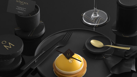
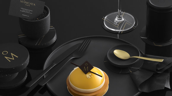
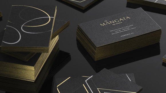
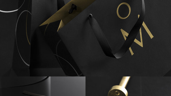
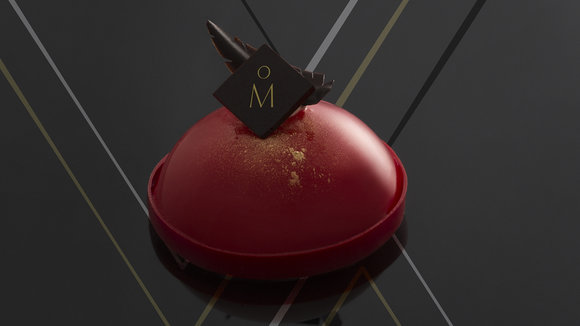
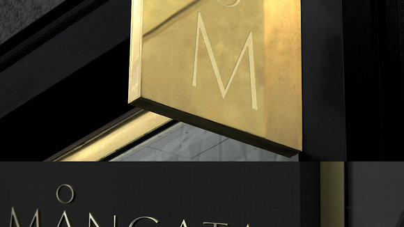
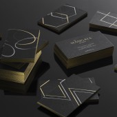
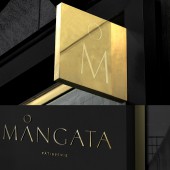
The concept is mainly focus to create a visual identity and system for packaging and other brand materials that is unique, strong and sustainable. Mangata has a different meaning in Swedish, a unique romantic scene : the glimmering, road-like reflection of the moon creates on the night sea. The scene is really inspired and visually appealed, so we brought it into the brandmark, making Mangata more unique and memorable but not overwhelmed its content. The colour palette, black & gold, imitates the atmosphere of the dark sea, also, gave the brand a mysterious, luxury touch.
发布于2018-12-25
设计师
M — N Associates
设计奖项
A’设计大奖
2018 年
颜色
相关推荐
