


1/6
Blue Goose Product Packaging
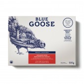
Visually, the need to embed the brand’s story in all aspects of its design inspired the use of hand-drawn illustrations on all consumer touch points. The cow, chicken, and fish serve as the focal point on the packaging. The animals themselves tell the Blue Goose story, and provide a rich and detailed representation of their natural environment, and the conditions they were raised in. The soft and stylized design approach conveyed the care that Blue Goose provides when rearing its animals and brought the new brand promise to life in a unique manner. The design conveyed Blue Goose’s premium and artisanal positioning, but did not construe the brand as stuffy or extravagant. The choice of blue separated the brand from competing marques, as it is a colour not traditionally associated with food, and served to beautifully juxtapose the healthy pink colour of the meat.
发布于2018-12-25
设计师
SID LEE
设计奖项
A’设计大奖
2014 年
颜色
相关推荐
