1/6
Architecture Factory Cork Institute of Technology
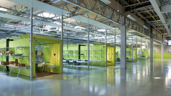
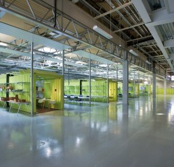
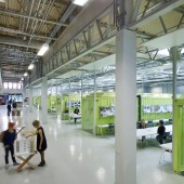
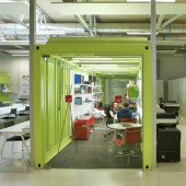
The Architecture Factory is a third level education and learning space situated in a disused split-level warehouse. The brief was informed primarily by cost effective occupancy and the desire for studio pedagogy. The design avoided traditional subdivision of walls and ceilings; requiring sub divided servicing and expensive firewalls. 6 shipping containers function as lecturer's offices dividing the space it into open studios separated from a mezzanine by an open boulevard acting as an exploration-learning lab, an opportunistic exhibition space, and the main circulation. Creating a visually open connection between occupants to encourage interaction between peer groups. Below the mezzanine frameless glazing minimally delineate the recessed acoustic boundaries avoiding a long monolithic horizontal interior façade. The balcony anamorphically distorts the perspectival emphasis. First floor transparencies offer excitement and vista to the activities below. Green shipping containers, reuse embodied energy and radiate a chromatic energy within the space. Roof sections are serrated creating a repetitive texture angled southward for light and away from the mezzanine windows for privacy. The resulting textural composition creates differing cognate compositions depending on whether they are viewed from above or below. Open plan studios occupy parti spaces between geometric organizations of containers in un-partitioned relief. Dedicated work-spaces with wire shelving above, function as both storage and acoustic baffle. The 6 acoustically open offices and studios function intelligibility well. Enclosed seminar rooms below the mezzanine provide more acoustically private spaces for theory delivery and discussion. Student-to-student learning is a natural consequence. The industrial heritage of the building strongly influenced how the scheme aesthetic maintained the genius loci. The use of containers reflects the manufacturing process. The white and grey provides an interior canvas carefully refined to minimize complexity. Color proportionality and density emphasizes the containers but is sensitively balanced not to perceptively dominate the space.
发布于2018-12-25
设计师
Marc O Riain & Neil Tobin
设计奖项
A’设计大奖
2014 年
颜色
相关推荐
