1/6
Quilmes Metal Bottle Beer packaging design
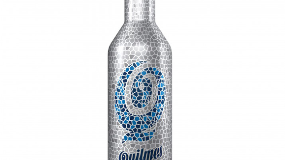
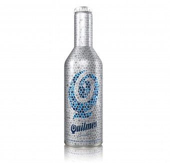
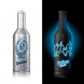
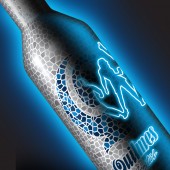
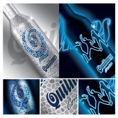
This packaging is revolutionary: it changes its graphic when exposed to an ultraviolet light. This singular and surprising characteristic has been magnified thanks to a design which is as attractive as innovating, regardless the light you see it under. The challenge was to transcend the graphic aspect and to generate a surprise element, a visual and tactile stimulation. The ghaphic proposal consisted on covering, with a delicate texture of little silver mosaics, the body of the bottle. By this means, the coldness of the material was counteracted and, on the other side, its lightness was taken to the extreme. These little mosaics alter the chromatic palette in the central part of the pack creating, with the combination on different blues, the letter “Q”, synthesis of the beer logo. The true magnitude of the proposal is best seen in the dark. Although it seems paradoxical, the main attraction of the bottle is not noted at first sight. It is necessary to see it under ultraviolet light to discover the “spirits of fun and meetings” hidden on the surface of the bottle. The complexity was to create a bi-functional design. Both designs, the one seen at a normal light, and the one appreciated with the ultraviolet light, have to have certain synergy. The ink used for the light reaction imposed certain conditionings, being the most important that no other ink can touch it. This limitation was overcome successfully thanks to the “kaleidoscope” design which has internal lines. With these, the silhouettes were created.
发布于2018-12-25
设计师
Adrián Gustavo Pierini
设计奖项
A’设计大奖
2012 年
颜色
相关推荐
