1/6
Yoshinoya Fast Food Restaurant
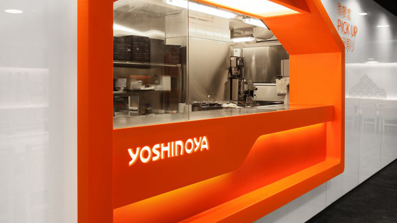
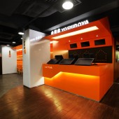
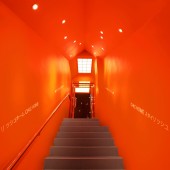
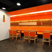
Designers Four Lau & Sam Sum used “Home” as the core design element to build a “Chic Home”, presenting the brand image as young, energetic, and warm. The shape of “House” created a marker that makes the customers easily associated with the new image “Home”. Giant Japanese chopsticks, Japanese wooden plate menus, and levels of distinctive colors have become the new image elements of Yoshinoya fast food chain. High malleability and varied house-shaped design could link different areas and makes the spaces more stereoscopic. The design of geometric triangles on the wall creates a diversity of design styles, was inspired by Japanese origami. It makes the “Home” vivacious and creates a relaxing and lively environment for dining.
发布于2018-12-25
设计师
AS Design Service Limited
设计奖项
A’设计大奖
2013 年
颜色
相关推荐


