
1/6
Klaipeda City 760-th anniversary Visual identity
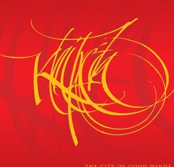
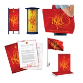
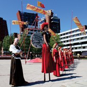
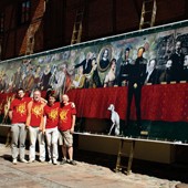
Klaipeda is the third largest city in Lithuania with a long history, situated next to the Baltic Sea. Getting an inspiration from calligraphy we designed the whole anniversary visual identity system: slogan “Klaipeda - City of Good Winds”, logotype, promo and representational materials, Klaipeda historical panorama, kinetic spatial composition “Klaipeda. 1252-2012 Historic Pendulum” as well as an interactive composition which metaphorically was called “Birds Chirping”. About "Klaipeda" logotype. Merging the words “City”, “Wind”, “Calligraphy”, “Anniversary” we designed a logotype – an attractive, vivid, emotion-rich, freestyle calligraphically written and digitized “Klaipeda” name. The official Klaipeda City heraldry red/yellow color palette was used as the main Klaipeda 1252-2012 visual identity color. Personally, we could compare it to jazz, with its continuous pulsation, rhythmic improvisation, expression, joy and a kind of freedom. We tried to find the proper balance between harmony, action and expressivity. It reflects optimistic emotions through attractiveness, visuality and style.
发布于2018-12-25
设计师
Roman Klemencov, KLEMENCOV GROUP
设计奖项
A’设计大奖
2013 年
颜色
相关推荐
