1/6
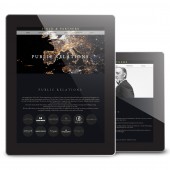
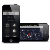
Finch & Partners Website
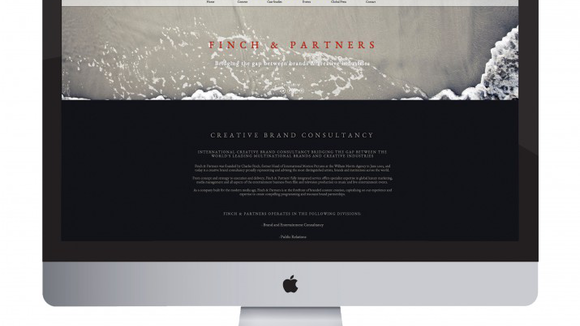
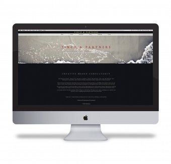
We took the approach of displaying the entire web content on a single page, allowing user interaction to be swift whilst providing a journey of discovery using hidden expandable content areas, all whilst maintaining a fluid layout. This includes the introduction of way points for easy navigation and parallax scrolling with a fluid layout.
发布于2018-12-25
设计师
CHC Digital
设计奖项
A’设计大奖
2014 年
颜色
相关推荐
