1/6
ZODIAC Pan-Asian Bistro Pan-Asian Bistro
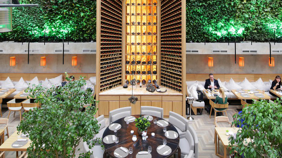
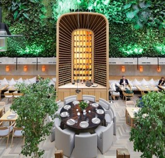
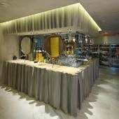
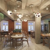
A room for the restaurant is located in quite a complex covered space – between the face of a historical mansion and mall’s solid glass wall 12 m high. The total area under design is 380 sq.m, including premises of the mansion that also house the kitchen and all engineering and utility services rooms. One of the core ideas of the project is landscaping of the wall 12 m high and 168 sq.m in area. It will blossom, emit scents, breathe, grow old and change its appearance. It grows all kinds of plants and Moscow guests will certainly be delighted to find themselves in these jungles amidst a Russian winter. This art object is complemented by provocative postmodern interiors of the restaurant. The VIP hall situated in the old-time mansion and finished with concrete is very demonstrative in this respect. This is a bolt from the blue for a Moscow’s premium restaurant. It is no wonder that visitors do not believe that the premises are ready for service. Expensive species of natural wood and stone in finish are combined with the harsh concrete touch of the walls and ceiling. This contrast is intensified by the curved lines of exposed wiring copper pipes. Exposed concrete has been used in the manufacture of architectural elements – bar, WC, columns, etc. Minimalist furniture made of light oak (Maruni, Japan), ceiling lamps used as plant pots (Bocci, Italy) and concrete structure of the bar add to the interior. This concrete structure is perceived as an art object, as is the case with a giant five-meter-long wine and tea portal cabinet in the principal hall. This custom-built cabinet reminds of a high bookstack with a ladder. This wine portal arch is visually backed up by mosaic boards suspended over the tables, a large round table (Heron Pagini Italia) with a metal top and round sofa and somewhat ironical armchairs by Andreu World (Italy). The furniture does not have an in-your-face style; it is rather perceived in its quality. It features a slight inclination towards the futuristic style of 1960s. General style of the premises evokes a sensation of verve of today’s trends in European design. Open and modernistic at the same time, thorough in details, it is designed to please the most demanding customers.
发布于2018-12-25
设计师
ARCHPOINT
设计奖项
A’设计大奖
2014 年
颜色
相关推荐
