1/3
The M-Wall is probably the first wall with a user experience
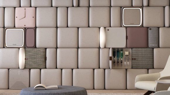
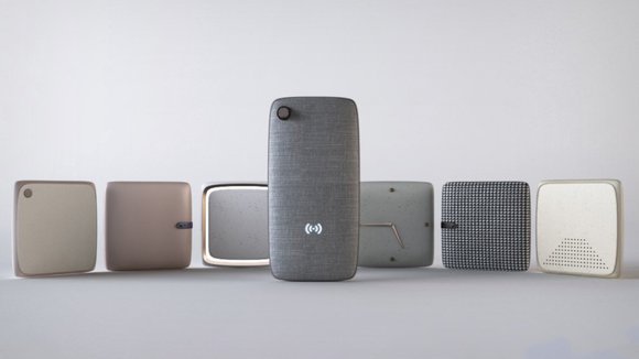
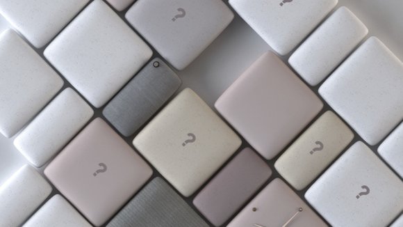
The M-Wall combines technology, beauty, and a user experience. Taking wall paneling and turning them into products/experiences, the M-Wall actually makes the wall a series of services, rather than a blank canvas. The soft, rounded paneling looks incredibly friendly, and hosts everything from clocks, thermostats, televisions, cabinets, lighting, speakers, and soft-boards, helping the wall transition from space to form.
The M-Wall conceptually isn’t completely new. Kitchens have for a long time come with products built flush into walls, allowing the entire cooking space to look clean, rather than be a cornucopia of appliances. The M-Wall takes that idea, bringing it outside the kitchen and into the living room, arguably in a way that’s absolutely refreshingly new. Its aesthetic interpretation is completely different from the silver metallic panels of integrated kitchen appliances. The M-Wall looks soft, calming, organized, functional, and I’m quoting Marie Kondo here, sparks joy!
The M-Wall is a winner of the
for the year 2018.
Designers: Lin Chengyou, Tong Zhiqiang & Wang Fuyang.
发布于2019-02-27
设计师
Lin Chengyou, Tong Zhiqiang & Wang Fuyang.
颜色
相关推荐


