1/15
The GameBoy lost some weight and got curvy (displays)
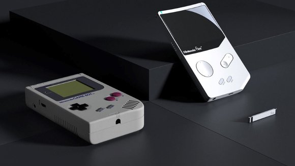
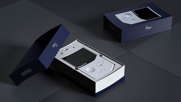
In the interest of nostalgia and Nintendo’s obsession with it, here’s the Nintendo Flex, a fan-made GameBoy update that gives the age old classic handheld gaming device a time-appropriate revamp. The Nintendo Flex is to the Gameboy what Daniel Craig is to Sean Connery. Same James Bond, but modern. (Sames Bond?)
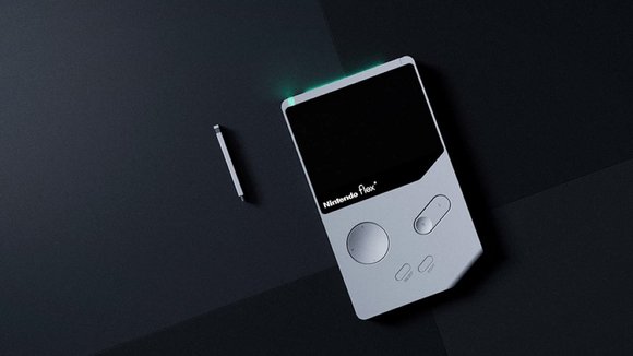
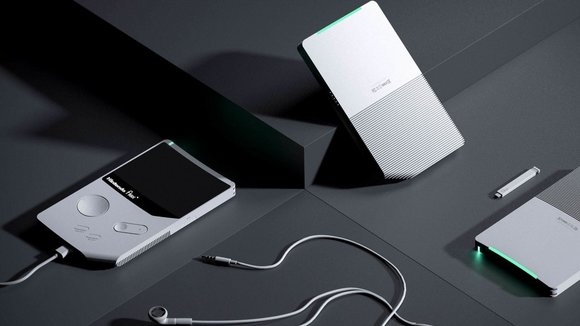
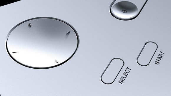
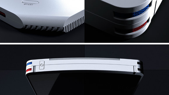
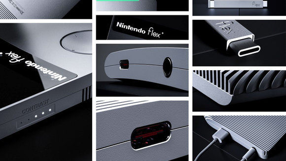
The Flex comes with a few very welcome updates. Bigger screen on a device that’s the same handy size (albeit thinner). The screen’s also mildly curved, giving you a slightly panoramic experience and adding just a tiny couple of more display inches into the same framework. The Flex retains the same keys and controls, but gives them a makeover too, opting for flushed surfaces rather than the original GameBoy’s chunky keys that stood out from the surface. There’s even a contrast slider on the side of the Flex.
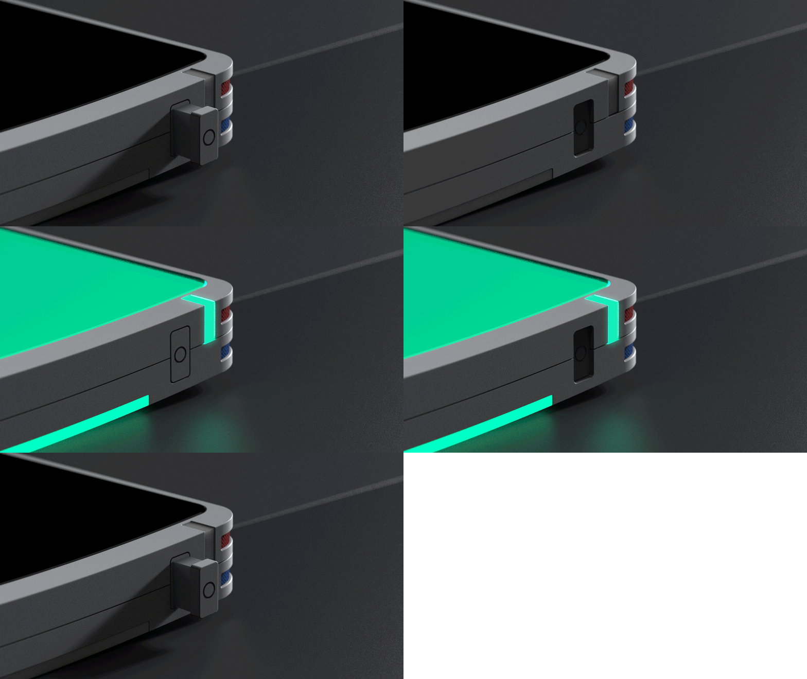
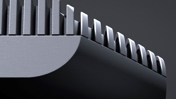
The Flex’s biggest overhaul, however, is the change in Nintendo’s cartridge system. Flex ditches the large squarish cartridges for something much sleeker and thinner, looking almost like a stylus. The stylus-sized cartridge slides conveniently into a slot in the Flex’s base, locking in place and becoming impossible to remove while in the middle of gameplay. You’ll be happy to know that the Flex also packs a Type-C charging slot and a (hallelujah!) 3.5mm audio jack, just like old times. And it also comes in the same classic old-world white color! (P.S. Brownie points to the designer for also designing a curved packaging box for the curved device!)
Designer: YJ Yoon
Don’t forget to check out YD’s
.
Don’t forget to check out YD’s
.
Don’t forget to check out YD’s
.
Don’t forget to check out YD’s
.
Don’t forget to check out YD’s
.
Don’t forget to check out YD’s
.
发布于2019-02-27
设计师
YJ Yoon
颜色
相关推荐
