1/6
Porsche Design x Huawei breathe a new life into smartphone Aesthetics
I’ve been rather verbose in my appreciation of Huawei’s experimentation with smartphone aesthetics. First came the stunning
, then came
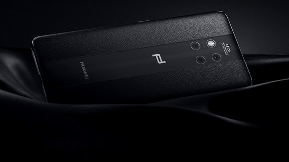
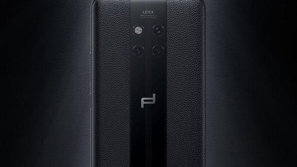
, with its unique square shaped 3-lens-plus-flash arrangement, and a metallic gradient that was even richer than before. Porsche Design put a spin on this particular model in Huawei’s line-up, and the Mate 20 RS was born.
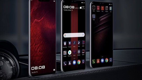
The Mate 20 RS is worth talking about because it’s no secret that smartphones are looking almost eerily similar nowadays. An industry that once prided itself in some wildly designed phones that went on to become icons of their times (the Moto Razr and Nokia N.Gage come to mind) is now filled with an eerily similar suspect line-up of phones, where the user literally spends hours trying to tell apart phones and sort the good from the bad. In getting Porsche Design on board, Huawei doesn’t just push the envelope, it also shows that smartphone companies should, once in a while, look outside their hardware design teams to work on aesthetics and detailing (take Philippe Starck’s Xiaomi Mi Mix 2 for instance). Porsche Design’s reinterpretation of the Huawei Mate 20 RS involves a leather and glass construction. With leather on two sides, you’ve got a phone that is great to grip and doesn’t slip easily off your palms. The glass strip running across the center forms a canvas for reflections and highlights to give the phone its mirror-finish appeal. It also looks like a racing stripe, giving the phone a sportscar vibe. Lastly, the presence of the glass strip allows the phone to charge wirelessly (at breakneck speeds of 70% in half an hour) too.
The Mate 20 RS makes a great case for getting product and industrial design studios and professionals (with interdisciplinary experience) on board to design smartphones, possibly making them stand out again, and ushering in the second golden era of mobile phone design!
Designers:
&
.
发布于2019-02-27
设计师
Huawei & Porsche Design .
颜色
相关推荐


