1/7
The Midtone Calculator shows us how to make gadgets less addictive
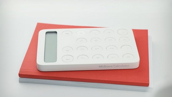
Although there’s a small likelihood that there’s a demographic of people who are hopelessly glued to their calculators, the Midtone Calculator by Selek Design shows us something greater. Maybe, to get us off our phones, tablets, etc, we need to make our gadgets less enticing and more utilitarian. While that isn’t a sound marketing strategy, it takes a much more ethical stance on technology addiction, and the Midtone Calculator is a wonderful example of a product built to serve its purpose and not scream for attention.
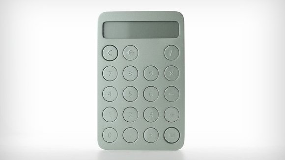
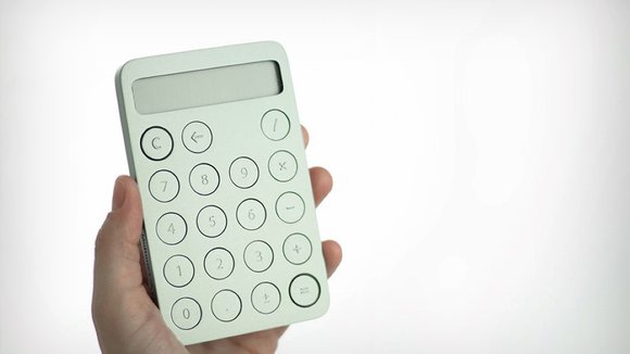
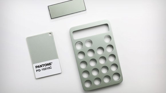
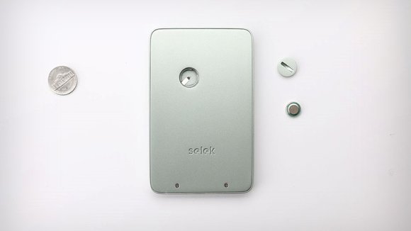
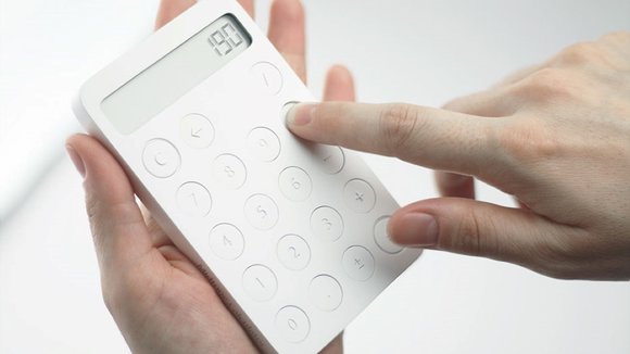
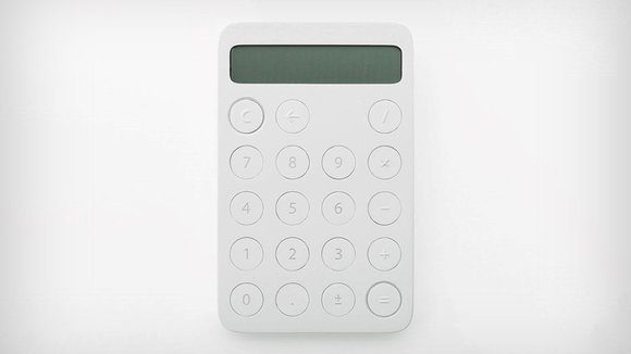
The Midtone Calculator is simple and straightforward. With a simplistic blockish form, and circular buttons that are neat, refined, and beautifully tactile, the Midtone Calculator literally doesn’t deviate from its singular color scheme. The extremely dialed-down form factor is supported by a single-color scheme with not so much as even print on the calculator. Any labeling, branding, etc. is done in the CAD molding, by adding 3D details (like the numbers and symbols). What’s more is that even the LCD display’s background color matches the color of the calculator (practically down to its Pantone value), making the product look pristine and absolutely unified.
The Midtone Calculator serves its purpose, but doesn’t scream for attention with extra features, colorful buttons, or any ‘fluff’. It would help if technology around us (physical as well as digital) looked to the Midtone Calculator for inspiration. As our species gets hopelessly addicted to products and digital interactions, companies are slowly admitting that the tech-addiction problem indeed does exist, and are working towards breaking them. It would be nice if tech giants could take a page from the Midtone Calculator’s book by building a stellar, remarkable device that fulfills its grander purpose (of serving its end-users), without addicting us with notification lights, app-popups, and bezel-less displays.
Designer:
.
发布于2019-02-27
设计师
Erdem Selek & Hale Selek .
颜色
相关推荐
