1/7
The Pros and Cons of having a laptop with a display-trackpad
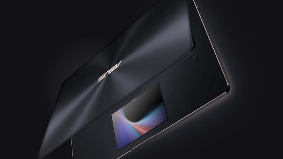
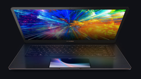
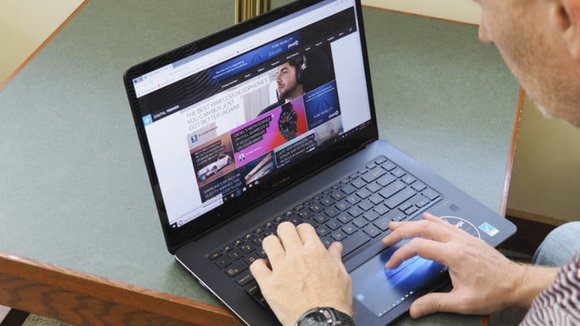
The concept’s been around for an insanely long time, and Apple’s even flirted with the idea by including the Touchbar in their Macbooks for a while now (but retaining the trackpad too). I guess you can finally say that Asus went the distance and rolled out their Zenbook Pro 15 (I’m having trouble keeping up with this nomenclature) which replaced the trackpad for a full-fledged HD-IPS touchscreen that they oh-so-conveniently dubbed the Screenpad. Here’s a list of reasons why the Screenpad is and isn’t a good idea. Since I’m usually on the more optimistic side of technological innovation, let’s look at the pros first.
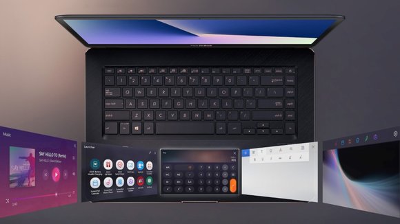
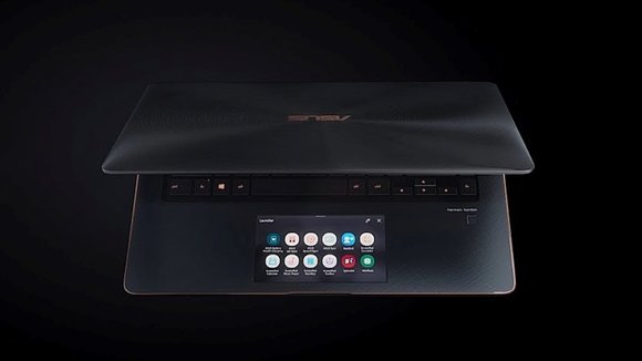
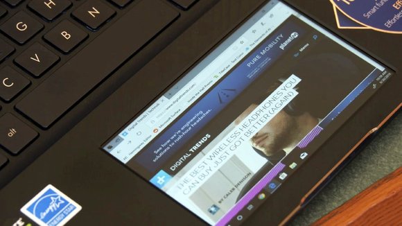
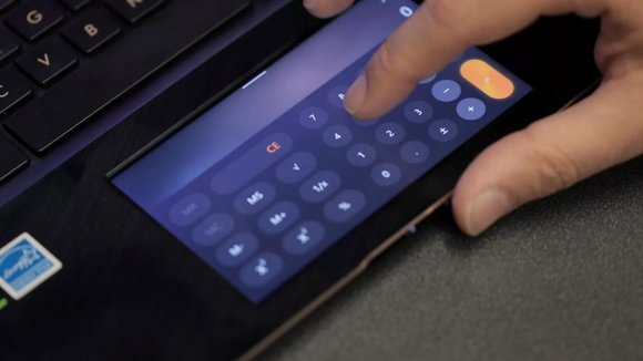
The most obvious advantage to having a Screenpad is the fact that it’s a secondary screen. Asus set the Screenpad up to be a secondary display that could run a mirror image of the primary screen, allowing your finger to effectively act as a cursor, letting you touch elements on your desktop and have them open on the primary display. The Screenpad is also built to be an extended display too, allowing you to have separate content running on both displays, in an effort to double productivity. In a lot of ways, the Screenpad is the more obvious upgrade to the Touchbar on Apple laptops, allowing you to do much more with its more conventional, rectangular aspect ratio. Its small size also mimics the smartphone, so that’s one less reason to have your smartphone around while you work on a laptop.
The cons are in a lot of ways extensions of the pros. A secondary screen mirroring your desktop is far from ideal given that the secondary screen is just 5.5 inches. Elements become extremely small if you rely on the Screenpad’s 1920×1080 ratio, and thankfully there is an option to scale that down to 800×600… but the problem persists. Screens are made for viewing, trackpads are made for navigating, and combining the two always results in a trade-off… which in this case translates into elements being too small and fingertips being too large for one’s liking. The purpose of a small screen also gets defeated when you realize that it’s a small screen running a desktop OS and not a mobile one (yes, Asus has tweaked the UI for the Screenpad but it has a long way to go and a lot of bugs to fix before it’s perfect). The extended view makes little sense if you’re going to be watching a video on a 5.5-inch screen while working on a larger display, or even reading articles online (or secretly browsing social networks at work)… in which case it makes more sense to have your smartphone around. The last con is the fact that the very placement of the secondary screen seems counterproductive because it breaks the workflow. Working on the laptop usually involves keeping an eye on the display while your hands get used to navigating the keyboard without you looking at it, and a Screenpad breaks that streamlined workflow. Having a second screen right under your chin can seriously break your workflow if you have to switch between looking up and down every few minutes. In that regard, the Screenpad sounds more like a theoretically practical but a functionally and ergonomically ill-considered feature. In that regard, I’d prefer a Touchbar, even though I’d probably force myself into using it till it integrates itself into my workflow.
Designer: Asus
发布于2019-02-27
设计师
Asus
颜色
相关推荐
