1/5
The biggest mistakes designers make in job applications
Applying for jobs everywhere and not getting through? Apart from the usual scramble of edits and redo’s, there are some simple mistakes we could be making which create a bad impression on our potential recruiters. To walk us through those small but infinitely important pointers below is a write-up by Carl Wheatley who specializes in the placement of design professionals. Get these simple but effective tips in place to ensure your application gets through the screening process.
Looking for a job? Check out
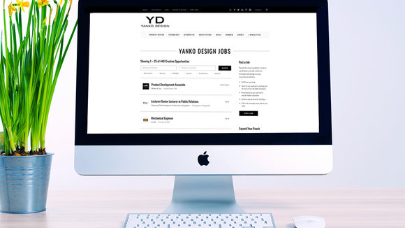
to find relevant job openings in the best design companies.
Recruiting a designer?
with YD Job Board to connect with some of the most talented designers on the planet.
I’m a design recruiter at
. For the past several years I’ve been in the design/recruiting industry. Before doing recruiting, I was a user experience designer and worked with many tech startups to design mobile apps. I also co-founded a Meetup called
where we connect designers with each other and create new opportunities.
Having started as a designer before becoming a recruiter, I know firsthand what it’s like to compete for the dream job and the importance of selling yourself and putting your best foot forward. I review hundreds of resumes and portfolios each week and believe there are eight common mistakes you want to avoid.
Using proper grammar and spelling indicates attention to detail, which is a critical element in design. Have a friend or mentor review your resume before you send it in.
Blurred images leave a poor first impression. Either you didn’t take the time or don’t have the pride in your work to ensure that your images are sharp and clear. There are plenty of articles and videos on how to create pixel perfect images.
It’s always tempting to showcase all of the great work you’ve done, but often less is more. Hiring managers don’t want to go through several different pieces of work and you don’t want to risk diluting your impact. Take the time to understand the organization you are interviewing with and select just a few designs that illustrate your best work and fit most closely with their style and tone.
Keep your portfolio fresh with new material. Many people invest in creating a portfolio once and feel they are done. Design is constantly changing with new software and tools. A talented, creative designer will evolve with these changes, coming up with new concepts and ideas. As you become more experienced your portfolio will reflect on your journey.
There has been a recent trend where designers show skill percentages for their design programs. An example might include, Design: 40% or WordPress: 80%. This is basically saying you are not fully proficient in these skills. It also minimizes the importance of creativity and the design approach that are arguably more important in evaluating a great designer.
There are so many phrases that are tossed around these days to describe someone’s abilities or skills in the workplace. Nothing screams fake rockstar more than
,
, or
—it’s an immediate red flag! You can call yourself whatever you want, but it won’t help you land your dream job.
There are a bunch of great website builders out there on the market. Spend a few dollars to remove the branding—or, better yet, build your own site. When you can, always try to customize your portfolio website.
It won’t take hiring managers long to notice that your work isn’t as strong as your portfolio theme. When creating your portfolio website it’s important not to outshine your own work. Keep your best work in your portfolio and make the design simple and clean. Just remember, companies are focusing on your most recent work.
YD has published the best of Industrial Design for over 15 years, so the designers you want are already on our network.
is our endeavor to connect recruiters with our super talented audience.
To recruit now,
with us!
The original write up by
.
发布于2019-02-27
颜色
相关推荐


