1/4
IKEA subtly redesigns its products for each country/culture
With its first Indian store launching only a day ago, IKEA proved that it understands its consumers and environment better than any other company in its industry.
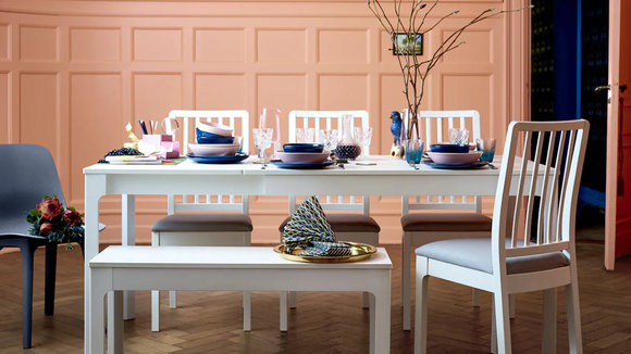
Allegedly, IKEA has been planning to open its flagship store in India for years now (I remember getting wind of it as long as 5 years ago). Now that the store is finally up and running, there’s one thing worth noticing and appreciating. In every country that IKEA runs its business, the catalog stays true to the company’s signature low-cost, DIY business model, but differs distinctly in terms of flavor. IKEA invests a lot of time, energy, and money, in understanding the country’s climate, its users, their mindsets, cultural quirks, and socio-economic background. Using that data, IKEA subtly redesigns their products to serve their users better, often pandering to their sense of style, budget, and even taking care of climatic requirements to ensure their products last longer than intended.
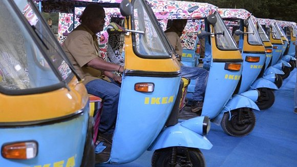
An article by Fast Company talks about how IKEA prioritizes user needs more than anything else, successfully differentiating between an American consumer, an Indian consumer, and a Japanese one, based on a variety of factors. With India, for instance, IKEA does away with the pine-wood construction it uses in more cooler climates (like in European countries). Pine cannot withstand the heat and humidity of India’s tropical climate, and IKEA’s furniture had to be tweaked to use a wood more durable for India. In a country as dusty as India, houses are cleaned every day with water. The furniture in the Indian catalog come with their own rubber risers so that the wood doesn’t come in contact with water. Kitchen counters are also redesigned keeping in mind the shorter frame of the Indian woman, be it the woman/wife of the house or the hired help. To accommodate for India’s small houses, burgeoning population, and the resulting cramped lifestyle, IKEA introduced a larger range of collapsible, stackable, and foldable furniture that can easily be stowed away when not in use. This furniture also serves its purpose when guests gather at your place for social occasions. IKEA also is reportedly using solar-powered rickshaws (an icon of public transportation in India) to deliver their products to the doors of consumers, therefore embracing the culture while forwarding the brand.
Similarly, for the Chinese market, IKEA showcased an entire section on balconies, an important part in Chinese homes. Showrooms in southern China showcased balconies with clothes-hanging apparatuses, while showrooms in northern China used balconies as areas for food storage, therefore highlighting the importance of cultural relevance while moving from country to country and region to region. As far as beds are concerned, IKEA’s a perfect example of understanding the socio-cultural implications of the countries it’s in. Korean beds are smaller, for small homes. American beds are showcased in king and queen sizes, while the rest of the world uses centimeters as a measuring format, and for its Indian market, IKEA showcased a bedroom with a smaller bed for youngsters because parents and children usually share a bedroom in middle-class Indian homes. In the kitchen, IKEA stocks far more rice cookers and chopsticks in its Asian markets, while the Indian kitchen showrooms don’t include knives as a part of the cutlery set since Indians usually use spoons at the table when they’re not using their hands to consume food. A rather bewildering spike in flower-vase sales in America had top executives confused until they realized that Americans were using them to drink out of, since the Swedish drinking glasses were too small for America’s ‘grande’ and ‘venti’ way of living. In every aspect of lifestyle, IKEA’s research has resulted in much more relevant products. Even their food-courts have food that’s much more in tune with the country’s culture and tastes.
What’s ingenious on IKEA’s part is that while they beautifully absorb some of the country’s cultures into their catalog, they still manage to forward their brand. IKEA’s catalogs change from country to country, continent to continent, but the store almost always looks the same. A large blue warehouse with the big, bold, yellow and blue logo on the outside is almost an icon of IKEA and is pretty much synonymous with “good furniture beyond this point”, no matter where you are. It also sticks to its universal style of nomenclature, using Swedish names for its products, and inevitably creating a beautiful fusion between what IKEA originally started out as, and the country in which it’s located… a fusion of global and local.
It’s rare to see a company so invested in user research, especially in the fashion/lifestyle/decor industry. Surrounded by competitors that spend time designing products with a one-shoe-fits-all business model, it’s refreshing that a company like IKEA spends so much time, effort, and money in ‘getting it right’. Explains why it remains such an undefeatable force in the furniture and home decor industry!
Source:
发布于2019-02-27
颜色
相关推荐


