1/1
XBox’s new controller design picks accessibility over aesthetics+ergonomics
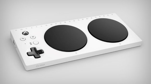
Recently leaked on Twitter by a certain @WalkingCat, the image above is the only one we have of XBox’s new controller made for accessibility (to be separately available, their original controller isn’t going anywhere!). Designed strictly for ease of use, the controller ditches the usual curvaceous palm-hugging format and button/trigger overload for a design that’s more table/lap friendly and simplistic.
Codenamed Project Z, the controller is for the specially abled, with two incredibly large A and B pads and a regular sized D-Pad to the left. The large buttons should be programmable, allowing users to set functions to each button/pad. There’s also a row of icons on the top like Power, USB, directional arrows, and the XBox logo, which seem to be light-up icons to provide visual feedback for the user of the controller. The controller also sports a MicroUSB port for charging and programming the pads, and an Audio input for headphones.
More on this at E3 next month when Microsoft will probably shine more light on Project Z! Personally, it’s a great initiative in the direction of inclusivity for the gaming company!
Designer: XBox
发布于2019-02-27
设计师
XBox
颜色
相关推荐

