1/3
Someone give Huawei’s CMF team a medal!
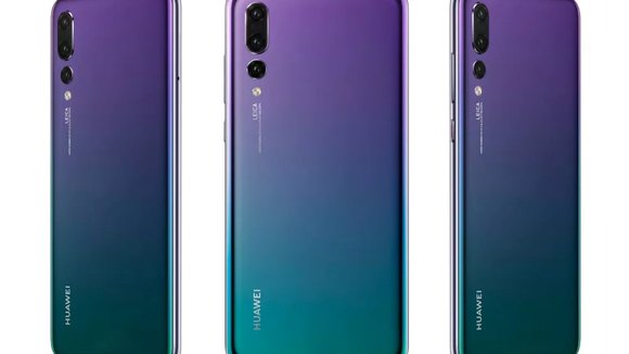
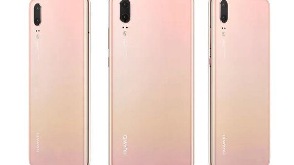
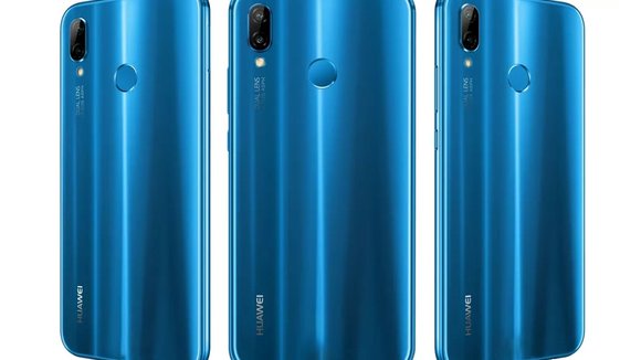
In this dull Space Gray and Rose Gold world, Huawei’s designers are working on a great phone that doesn’t just perform well. It breaks the barriers of smartphone CMF. So much focus has been given to phone’s fronts that the back now seems like an afterthought. Huawei’s P20 treats the back with just as much importance, making it look as pretty as a picture because if you can set a beautiful wallpaper on your display, your phone’s back needs to shine through as well, looking just as visually pleasing as the front. Sorry, Google Pixel. You tried, but your Kinda Blue was rather insipid and unimpactful.
There’s a great deal of composition in the P20’s colors. The hues look remarkable, and you stop to notice the phone in its entirety, rather than how most phones use super-glossy finishes and creative lighting to showcase beautiful highlights on their bodies. Their colors usher in what I believe is a renewed Nokia Lumia movement (Nokia’s Lumia phones were famous for their dazzlingly delicious colors). These shades and finishes elicit joy out of me the way scrolling through
would. There’s something refreshing about them and makes them look premium and great at the same time (my heart belongs to that purple-blue gradient). It’s a shame most of us would cover them with protective cases, however.
Designers: Huawei
发布于2019-02-27
设计师
Huawei
颜色
相关推荐


