1/6
‘Breaking the mold’ of soap design
Never did I think that I’d one day write about soap design, but you have to marvel the fact that someone spotted the problem all of humanity struggled with, but didn’t bother solving. The slippery soap.
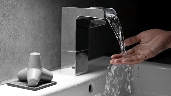
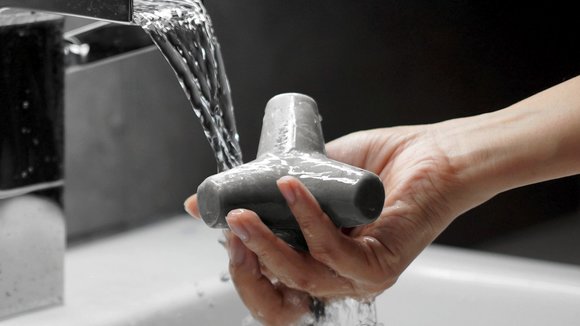
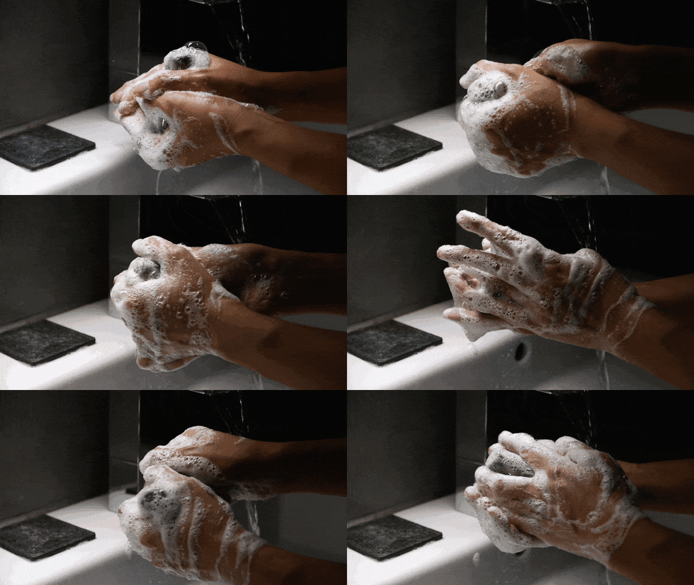
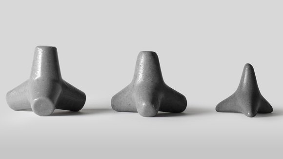
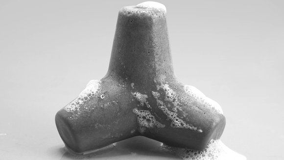
Soaps are probably too organic shaped for their good. Anyone who’s even used something as non-slippery as a phone can say that the bar shape isn’t hand-friendly. Candybar shaped stuff have an inherent tendency to slip out of your grip, so the Tetra Soap is everything but that. Designed to be as grippy and ergonomic as possible, the soap comes in the shape of a wave-breaker, giving you a great amount of surface area to work up a lather, while making sure the soap is easy to hold onto even (especially) when wet. The shape even comes with ‘legs’ that let you rest the soap on a soapdish naturally. What’s more, the wave-breaker shape allows the soap to remain ergonomic even as it erodes away, letting it be easy to hold and useful until the very last day. Plus is it just me, or does the eroded form of the soap look just as eye-catching as its original shape??
Designer: FURNITURY
发布于2019-02-27
设计师
FURNITURY
颜色
相关推荐
