1/14
Print is NOT dead!
The designer of the Print camera concept raises an important question? 20 years later, when you want to show your kids or grandkids snippets and memories of your life as a young person, what will you do? Direct them to your Instagram? Or provide them with a Google Drive link? No, right?
Memories are best preserved and relived in the tactile format, and that’s why Polaroid is making its comeback. There are some memories that should be personal, not on social media gathering blind-likes from practically virtual people who you haven’t met or talked to in years. Print steps in to pioneer that movement with a camera that acknowledges the print format.
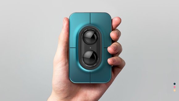
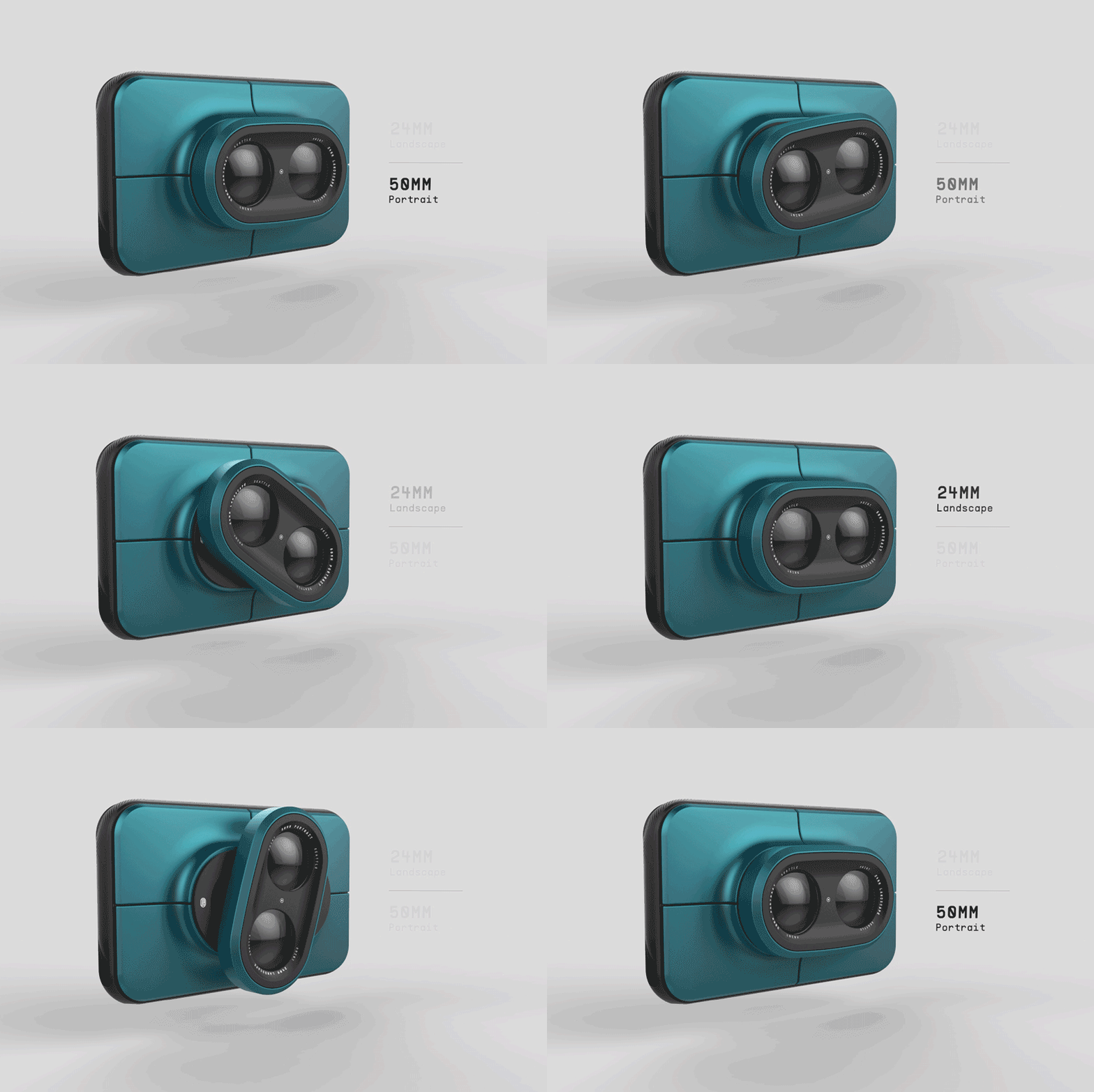
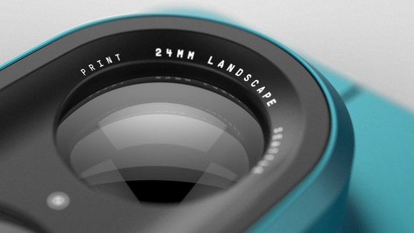
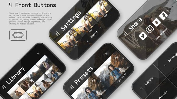
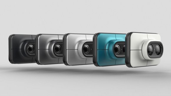
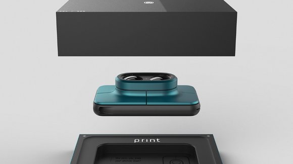
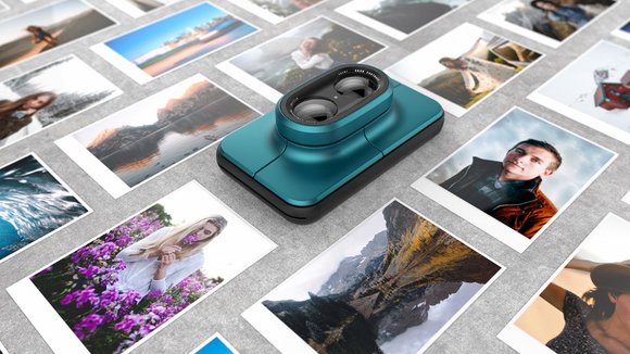
Truly simple and smart in its design, the camera features one beautiful screen, 4 buttons on the front, and 2 interchangeable lenses. The screen on the back virtually ditches the bezel (looks like we have a design trend here). It looks a lot like a touch-input screen based on the UI, but is virtually completely controlled by buttons on the front. These large buttons are hard to miss, as they form the front facade of the product, divided beautifully by parting lines that run symmetrically across the product. The two interchangeable lenses allow you to switch between Landscape and Portrait styles, somewhat like the iPhone 7’s camera options.
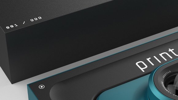
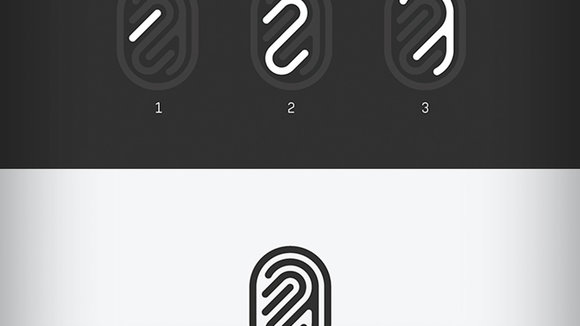
While Print champions the instant-print format, it doesn’t abandon the web. The camera also allows you to publish your photos online on social media, or save them to your phone (as per my knowledge, only Fujifilm’s latest Instax Square SQ10 allows for physical and digital image storage). We also love the incredibly intuitive branding for the Print that outwardly looks like a finger’print’ but also contains the numbers 1, 2, and 3, in it, just tipping its hat to our age-old tradition of saying “One Two Three Cheese!” before we click a picture!
Designer:
发布于2019-02-27
设计师
Jordan Steranka
颜色
相关推荐
