1/12
For Picture-Perfect Toast!
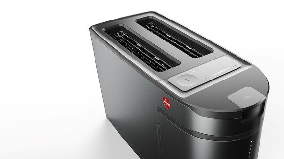
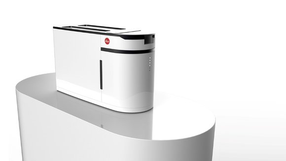
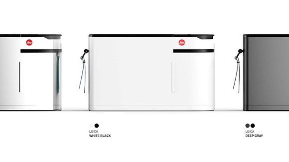
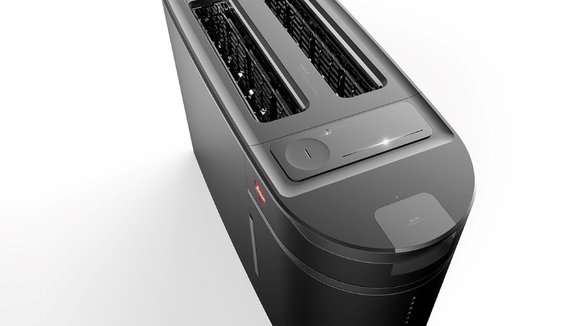
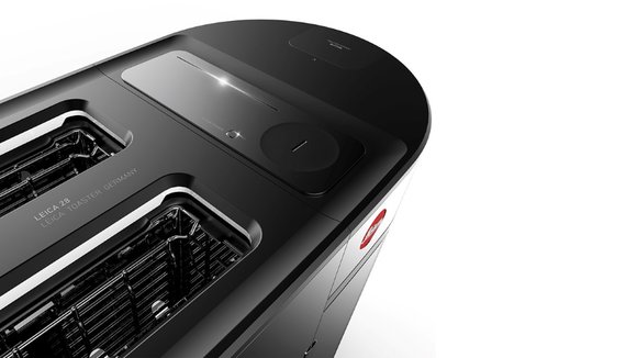
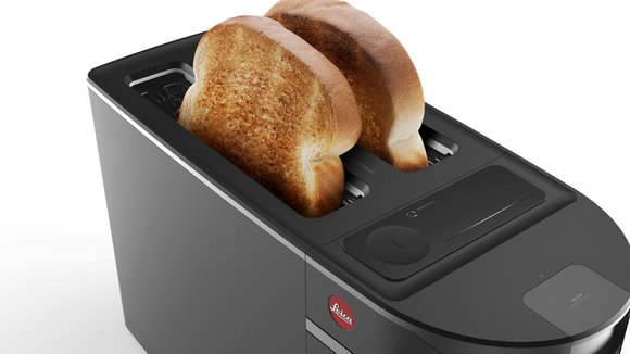
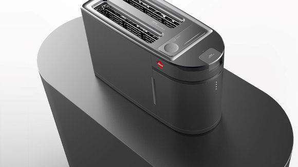
If you look at a camera’s proportions, they’re really similar to the proportions of a toaster, sans the lens of course. Using that observation to their advantage, designers Hyunmook Lim and PDF Design decided to pull an old switcheroo on Leica’s product portfolio by introducing a Leica toaster. Even without the latge circular lens, the toaster looks strangely camera-ish, and definitely Leica-ish. The flat geometric surfaces along with the choice of color and finish make it fit well into the German camera-maker’s portfolio. The simple circular red logo on the side acts like a perfect punctuation to complete the design’s visual grammar.
Designers: Hyunmook Lim & PDF Design.
发布于2019-02-27
设计师
Hyunmook Lim & PDF Design.
颜色
相关推荐
