1/7
Shockingly good design!
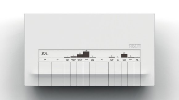
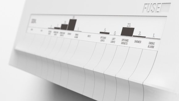
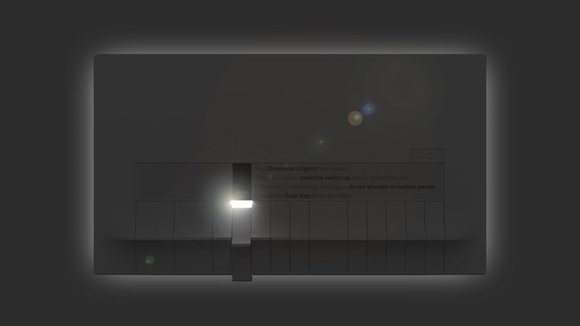
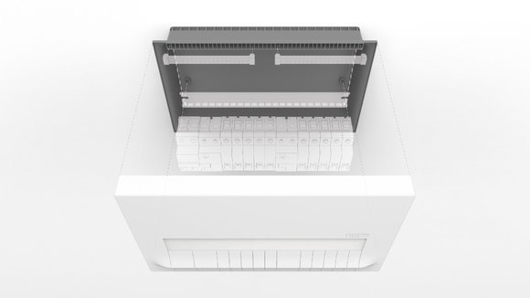
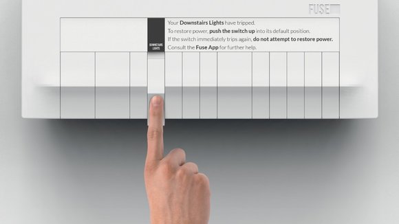
There are so many objects that rarely see any design intervention because they “are just fine the way they are”. A designer with a keen eye can pick out such design opportunities and really shake things up for the better. Dan Salisbury’s Fusebox redesign is exactly what I’m talking about. The design is a beautifully integrated layout of switches and even an e-ink display that helps you identify not just what each switch is for, but also the power consumption and load-bearing percentage. The switch gets lowered when the circuit breaks, in a way that makes it look elegant yet easy to identify. Lights out? No problem, each fuse switch has a backlight that goes on in the dark.
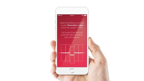
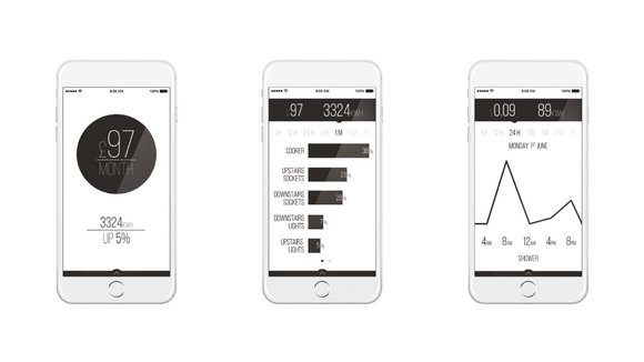
Just to sweeten the deal, the Fuse concept comes with a dedicated app that gives you all the info bundled into a slick, beautiful interface!
The Fuse concept received the
and the
in 2015.
Designer:
发布于2019-02-27
设计师
Dan Salisbury
颜色
相关推荐
