1/9
Classy Curved Chromebook
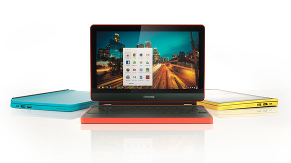
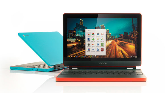
I love technology, but constant advancement leads to one problem. Everyone ends up wanting their devices to have processing power, but no one focuses on making the product experience desirable. Charging cables start fraying, laptop hinges start getting loose, the rubber feet on the base of your ultrabook start coming off. Designer Mauricio Romano thought it would be a good thing to redesign the Chromebook (known for their low-end construction) to make it beautiful in every sense.
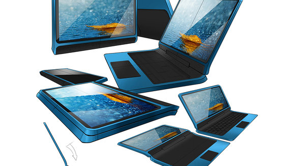
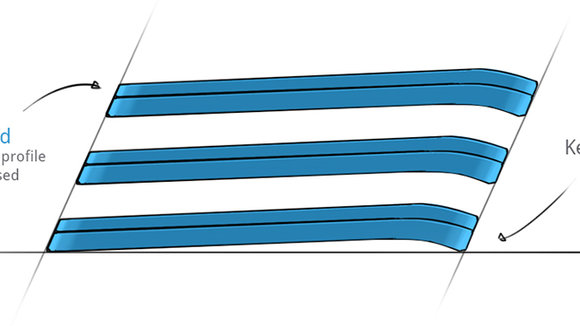
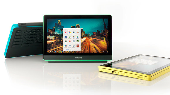
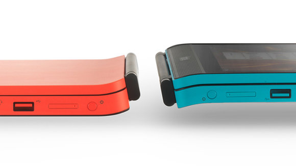
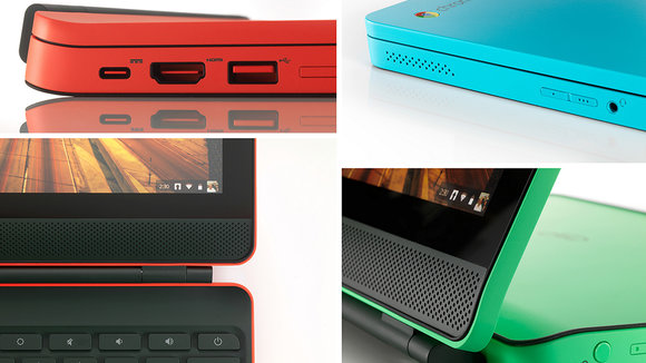
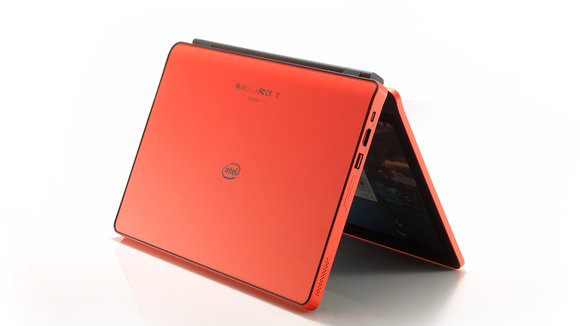
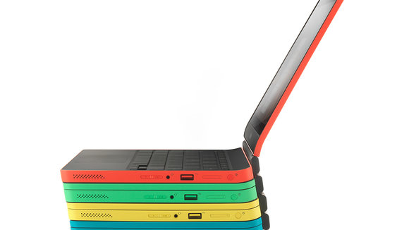
The new vision of the Chromebook solves two nagging problems. One is how when in tablet mode, the keyboard ends up brushing against the table, making the keys get scratches or pick up dust. Also, since most laptops now have tapered ends to suggest sleekness, the trend has found its way into hybrid laptops and Chromebooks also, and that means in tablet mode, there’s an unsightly gap between the keyboard and the screen. The new Chromebook concept does an absolutely marvelous job of getting past the two aforementioned deal-breakers; and looks good while doing so too!
Plus, with its absolutely yummy color scheme, it should come with a warning that says “Electronic Product. Do not attempt to taste!”
Designer: Mauricio Romano
发布于2019-02-27
设计师
Mauricio Romano
颜色
相关推荐
