1/9
The top five design portfolio tips of 2019 from ‘Sam Does Design’
Hey I’m Sam and I do design. Some of the most popular YouTube videos I make are about portfolios and tips on getting a design job. For that exact reason, I wanted to write about portfolios here so I can share this information with you.
I’m the first one to admit that I have limited experience in the real world, with just two years of post-grad experience to my name. However, now that I’m sat on the opposite side of the interview desk, I have already started to see patterns emerging within the vast number of portfolios that I see. That also means that I can spot the mistakes that people make again and again. In order to help you, and to save myself from going through another portfolio with mistakes from someone who doesn’t know any better, I’m here to let you know EXACTLY what I look for.
Using these 5 techniques will be sure to improve your portfolio and make it a pleasure to read. If you’re unsure on what format your masterpiece should take, make sure to catch up on my last article for the pros and cons of PDFs, personal websites, portfolio websites, and printed books.
The real world is different to university. As much as I would like there to be, there is no mark scheme, work schedule, or banded grade system. This means that you do not get extra points for showing more work. You actually lose points for showing filler work. I am guilty of this too, but it’s definitely worth only showing the work that you are truly proud of. Your portfolio is only as good as your worst project.
As I mentioned in my last article, a red carpet set design company needs to see that you can design red carpet sets. Without seeing the work that the company needs help with, they cannot employ you because it becomes a risk when compared to someone who showcases it. You need to show the company that you’re already doing the work that they need help with. If that means spending some time on a personal unpaid project, then it could make all the difference when applying to your preferred design field.
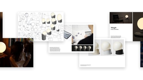
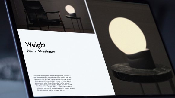
Each project needs to clearly show the problem that it’s solving, the journey the design took, and the decision making in the process. I find the best way to do this is to imagine each project is an article for a design website. This means capturing the audience with an in-context hero shot at the very beginning, followed by “the behind the scenes”, and then finishing with hero shots at the end. Without seeing the context shot at the start, there is no clear direction for the “behind the scenes”. Without the “behind the scenes”, there is no substance. Without the final hero shots, there is no finale. Using this formula can be seen in my portfolio reviews again and again.
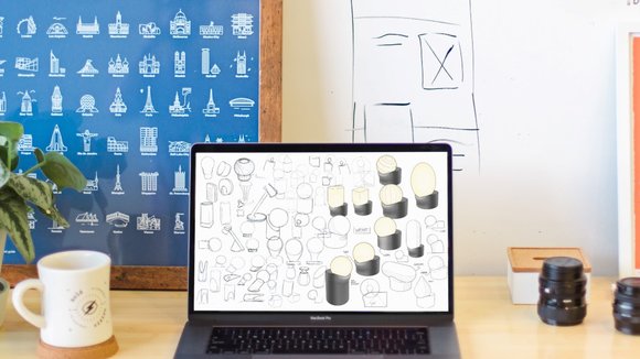
While it is important to explain the whole story, it is industry standard to spend a maximum of 10 seconds flicking through an entire portfolio. Designers and hiring managers don’t have time to read all 100 portfolios they see word for word. Paragraphs should be kept to a minimum at all times. That means showing your skills naturally through visual means, and in turn means integrating your skills into the projects. From what I have seen, those with less experience will have dedicated “sketching” and “rendering” pages – showing a mish-mash of projects and segregating their portfolio into skills. This is something that schools and universities may use to assign marks or check that the work is being done, but it is not how the real world works. Your skills should be apparent and wrapped in the narrative of your project case studies, which should be beautifully laid out, with as little text as possible.
I can’t believe I just wrote that on the internet and I feel like a horrible person for suggesting it. But this is the one time in life when you should compare yourself to others, because your employer will be doing so as well. Ask yourself, would you employ yourself if you saw your portfolio for the first time? How about when compared against 5 other portfolios? What can you do to improve? You should be critical of your own submission before the employer gets a chance to be. As the saying goes, you are your own worst critic.
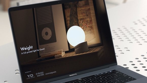
You can see how I documented the Gantri Weight light throughout this article. By using these 5 tips, I’m sure that your portfolio will be the best it can be. Good luck!
Sam Gwilt is an industrial designer with an eclectic mix of skills. He graduated Brunel University London and worked for Paul Cocksedge Studio, specializing in bespoke lighting installations and exhibitions internationally. He now works with clients globally at consultancy Precipice Design, and also runs an
and
– Sam_Does_Design – where he shares industry tips with the community.
发布于2019-11-18
颜色
相关推荐
