1/3
Redesigning the ruler with a better user experience
When you use something all your life, you tend to take it for granted. You internalize its flaws and just live with them until someone designs something better that everyone then collectively embraces. Take the ruler or scale for instance. Its simple design is one of those rare instances where simple isn’t equal to good. Designed as a flat piece of wood/metal/plastic with equally space markings, rulers are great for measuring, but try lifting one off a flat surface and you’ll find yourself constantly pinching the instrument just to get a grip so you can lift it off the desk. Its flat design is also difficult to grip onto as you’re using it to draw lines. Sometimes the pencil slides onto the ruler, sometimes the pencil and ruler slide together, resulting in a crooked line running across your page.
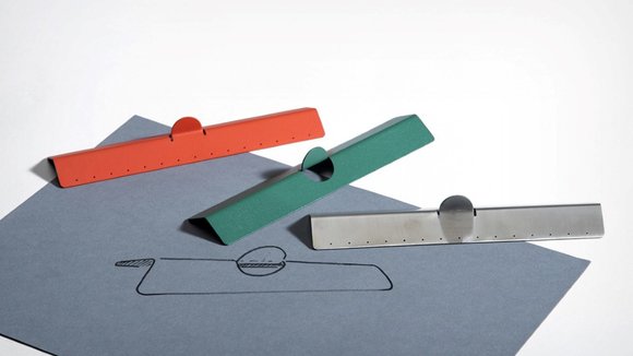
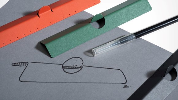
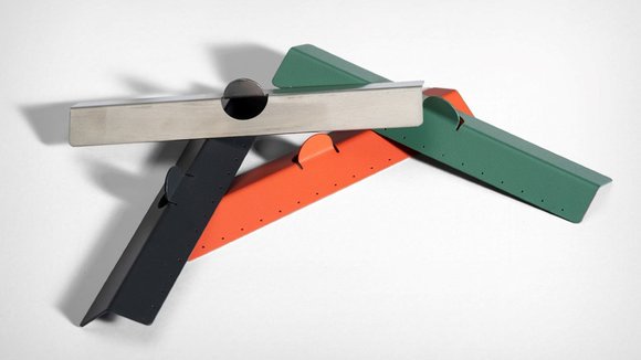
Akhil Raj’s Pick ruler doesn’t have any of those problems. Punched out of sheet metal, the Pick Ruler is angular, so it doesn’t rest flat against any surface. It even comes with a semi-circular tab that’s easy to grip onto, helping you pick up the ruler or hold it down onto a surface with ease, while the angled plane on the Pick makes sure your pencil has a channel to move up and down in, without slipping. To up the Pick’s aesthetic appeal, it comes with a powder-coated finish, and instead of markings, has tiny visible perforations on it that’ll never accidentally get scratched or erased out!
Designer:
发布于2019-11-18
设计师
Akhil Raj
颜色
相关推荐


