1/3
blank Corporate Identity
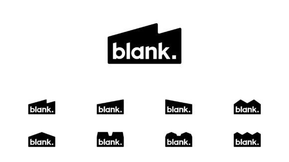
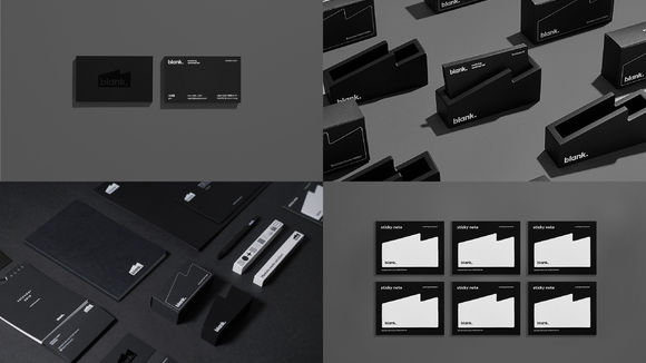
Initially a content business, BlankTV has meanwhile created its own lifestyle brand. Recently, the company wanted a redesign of its CI that dropped the "TV" in its name. The company sees itself as a "think factory," creating values for a better life based on innovation. The logo depicts a "think factory," the dot adds stability, and the square-shaped period implies "supplying a solution." Additionally, the rebranding includes a new font inspired by the logo, the blank sans font. To roll out the new blank brand name, different graphic designs were adapted for use with various elements ranging from name cards, signage to spatial design, thus creating a coherent image of what "being blank" means.
发布于2019-11-28
设计公司
blank Corporation
设计师
Sehoon Na (Chief Director)
Youngeun Oh (Brand Design)
Sunhee Park, Jieun Ha (BX Design)
Inwook Song (UI Design)
设计奖项
德国iF设计奖
iF DESIGN AWARD/iF设计奖
2019 年
颜色


