1/2
DABANG
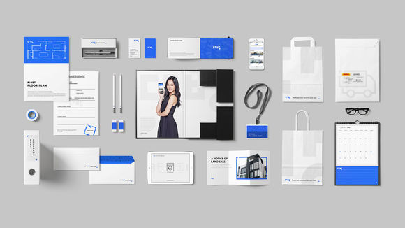
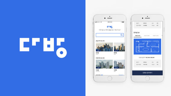
DABANG is Korea's first real estate mobile platform. The app's former branding identity did not express keywords in the company's brand message, so a new one was developed. This redesign visually improves on structural imperfections in the old branding, also bringing in scalability for future iterations. Using the company's "Better Arrow" graphics motif lends consistency to its communications and collaboration with other companies, services, or brands as well as to internal and external communication and graphic elements. Pairing the icon and brand name can dilute the brand identity's impact. Therefore, the company opted for the Korean word Hangul as a graphic symbol to create a stronger, more coherent impression.
发布于2019-11-28
设计公司
Station3
设计师
Woo Suk Lee
Jun Woo Park
设计奖项
德国iF设计奖
iF DESIGN AWARD/iF设计奖
2019 年
颜色
相关推荐


