
1/2
Giant Orange
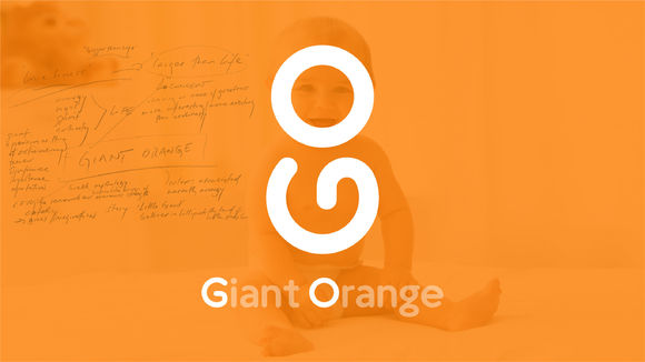
Giant Orange specializes in baby and maternity services and products. The English letters G and O are combined in a single logo graphic, which is an obvious reference to a baby. Rotating the logo ninety degrees clockwise transforms it into GO, which skillfully conveys the brand's tagline "upward growth; let's go together." The English brand name Giant Orange sends a message of "larger than life," resembling a lively person with surprising energy. The Chinese word for "orange" is "cheng," a homonym with another word that means "to succeed, to become," thereby sending good wishes to newborns to do great things.
发布于2019-11-28
设计公司
Dongdao Creative Branding Group
设计奖项
德国iF设计奖
iF DESIGN AWARD/iF设计奖
2019 年
颜色
相关推荐
