1/7
LAI SHI-GANG 919 Classic Liquor
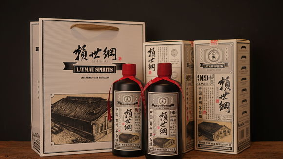
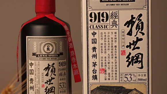
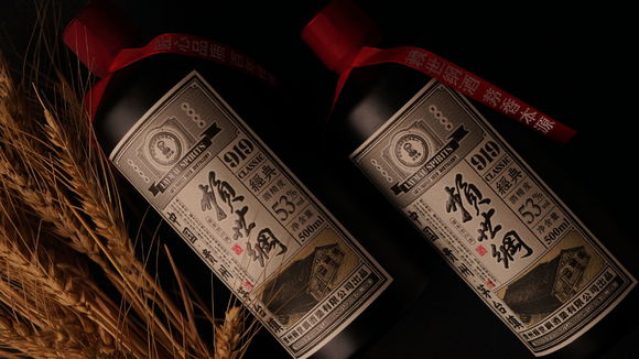
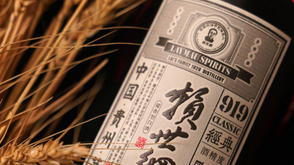
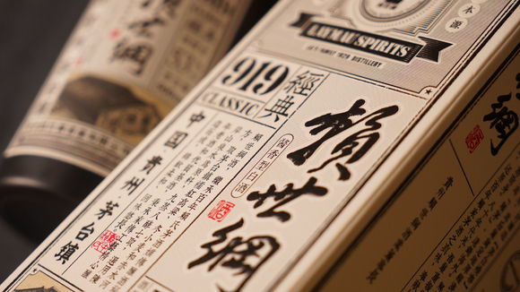
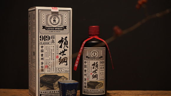
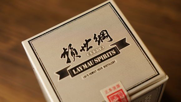
Lai Shi-gang is the inheritor to a family liquor business that traces its foundation to Qing Dynasty (1636–1912). In 1929, Lai’s brothers rebuilt the family distillery. The hand-painted image of the distillery building is featured on the label. Inspired by newspapers from the Republic of China and Chinese Calligraphy, and using black and white classic color and advertising typesetting juxtaposed with traditional red seals, the label suggests the eras spanned by the product. Chinese liquor packaging rarely dares to use such a simple design and is mostly rich in color and motif stacking. Precisely because it uses a classic design, this packaging suggests the rich pedigree of the product.
发布于2019-11-28
设计公司
GUIZHOU LAISHIGANG LIQOUR CO.,LTD.
设计师
Shuai Lu
设计奖项
德国iF设计奖
iF DESIGN AWARD/iF设计奖
2019 年
颜色
相关推荐
