
1/2
Hwa Ae Rak & Hong Cheon Ung
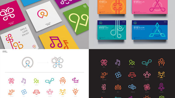
The brand identities for the women's brand Hwa Ae Rak and the men's brand Hong Cheon Ung were designed together to complement each other. Today, we no longer think of middle age as a time of aging, but as the "golden age," the most beautiful time in life, where people are closer to reaching their dreams and goals. The new brand logos represent the discovery of a person's golden age, casting the individual as the heroine or hero. While the two logos' outer shapes are identical, their centers diverge: a flower petal is the middle point of the Hwa Ae Rak logo while the Hong Cheon Ung logo uses a diamond. The gradient colors represent the ever-changing and transforming power of happiness and success.
发布于2019-11-28
设计公司
korea ginseng corp (KGC)
设计师
So Jung Lee, Byung Hwa Lim, Sang Ah Lee (Graphic Design)
设计奖项
德国iF设计奖
iF DESIGN AWARD/iF设计奖
2019 年
颜色
