

1/7
Lugano Region
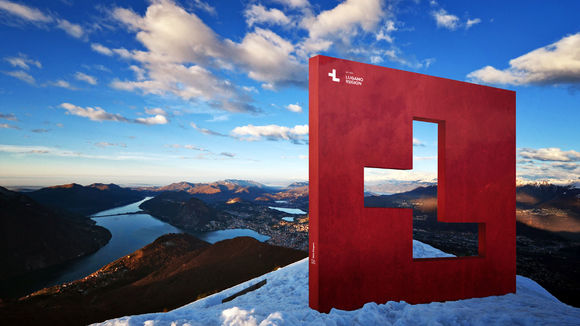
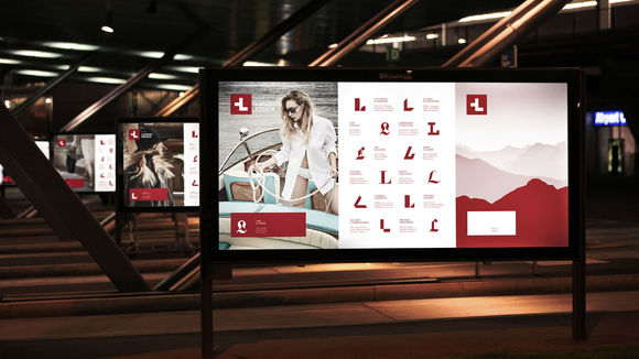
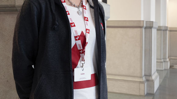
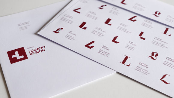
The Lugano Region, situated in the very south of Switzerland, wanted to update its branding. The area is a very atypical destination in Switzerland, boasting palm trees, olive oil, Mediterranean cuisine and weather, but all in the safe, quiet, efficient environment of Switzerland. The new branding sent the message that Lugano is "differently Swiss." As visual symbol of this theme, the Swiss flag's famous white cross was transformed into the letter "L" for Lugano. Designers also created a wide range of fonts for the letter "L" to represent the variety of activities offered by the region, each font in a unique style that matches the corresponding activity category.
发布于2019-11-28
设计公司
Caselli Strategic Design
设计师
Fabio Caselli
设计奖项
德国iF设计奖
iF DESIGN AWARD/iF设计奖
2019 年
颜色
相关推荐
