1/7
Taipei Smart City
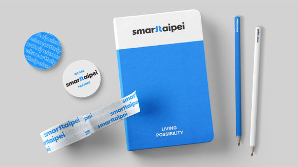
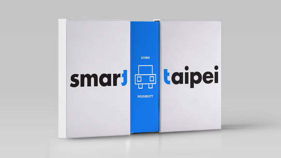
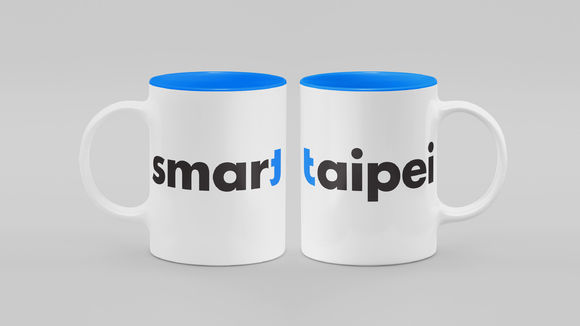
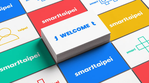
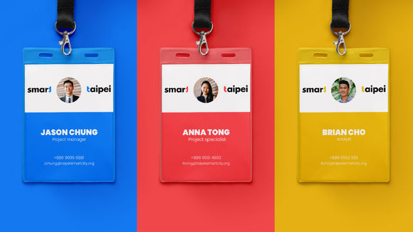
Smart Taipei is a city transformation program that turns the city into a testing ground for innovations. In the logo design, the two “t’s” from “Smart” and “Taipei” are connected to form the Chinese character for Taipei. In applications, the character can open up (separation of “Smart” and “Taipei”) to symbolize a welcoming attitude, while the space between alludes to endless possibilities. Vibrant colors reflect diverse aspects of smart living in Taipei. Dynamic and vibrant, the brand design presents Taipei as the breeding ground for pioneering ideas, where possibilities take shape and grow.
发布于2019-11-28
设计公司
RedPeak Asia
设计师
Chris Chung, Yong Joon Cho, Lydia Han, Lillian Liao
设计奖项
德国iF设计奖
iF DESIGN AWARD/iF设计奖
2019 年
颜色
相关推荐
