1/2
SAMSUNG FIRE & MARINE INSURANCE Annual Report 2016
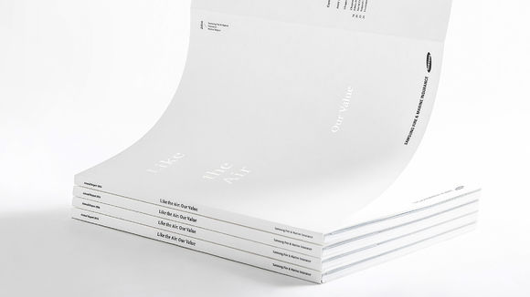
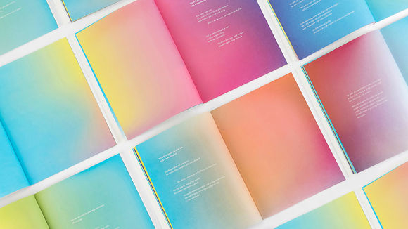
The annual report design is based on the concept of "air" and the brand's core value, "good insurance." Rather than just visualize these themes in the publication's graphics, the company opted to inject its brand values into every design component. The paper was made from air-infused pulp; fragrance was infused into the booklets for a multi-sensory effect. The pages themselves were colored in gradient tones, representing the spectrum of fragrance emitting into the air. The brand color of "Spring Blue" was the key color, also the main color in charts, infographics, and illustrations to give the report a unified overall look.
发布于2019-11-28
设计公司
PlusX
设计师
Myungsup Shin, Junyong Lee, Kyungmoon Min, Mihyang Kim, Yerin Han
设计奖项
德国iF设计奖
iF DESIGN AWARD/iF设计奖
2019 年
颜色
相关推荐
