


1/7
OPTIK NILL
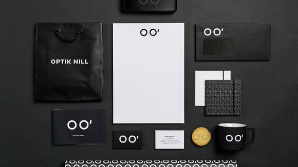
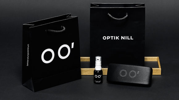
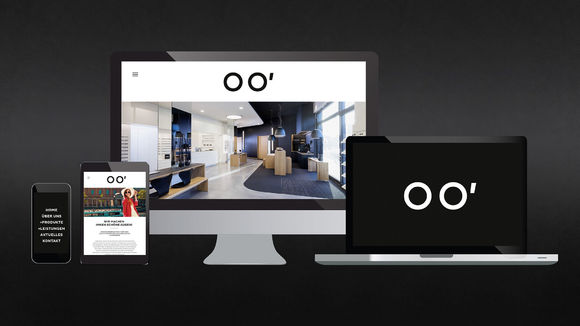
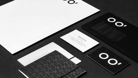
Eyeglasses are a common motif in the design of optician stores. The uniqueness of the OPTIK NILL corporate design, its direct impact on the viewer’s eyes, derives from optical physics. Based on the word OPTIK, the logo cites two symbols that many will remember from physics lessons at school: O as the point of an object and O’ as its corresponding image point. The two perfectly arranged circles charmingly visualize glasses – the store's core product. At the same time, customers see a pair of happy eyes, which reminds them of the company’s philosophy: Nice to see you!
发布于2019-11-28
设计公司
Nadine Nill Design
设计师
Nadine Nill
设计奖项
德国iF设计奖
iF DESIGN AWARD/iF设计奖
2018 年
颜色
