1/6
She Why
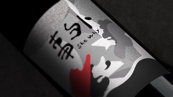
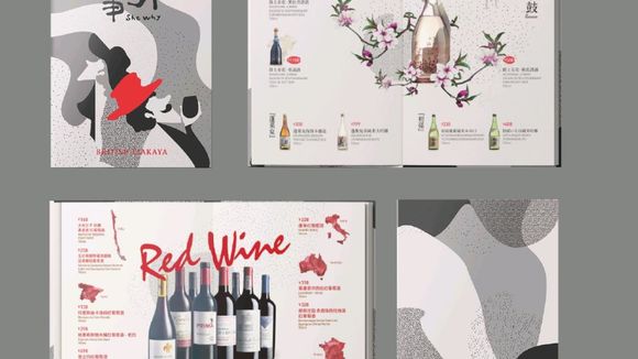
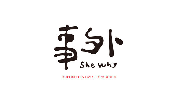
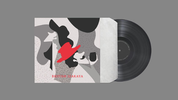
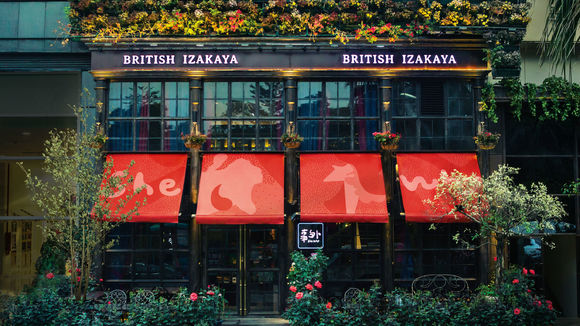
The writing is simple, combining expressions of nature and freedom in the menu of the "She why" izakaya (a type of informal Japanese pub). The designer chose Chinese calligraphy for the main of logo, making slight changes in details so that the characters appear 'drunk'. The irregularity of the font boundary represents the hazy, beautiful, clear, and free innovation of the "She why" brand.
发布于2019-11-28
设计公司
Shenzhen Xinsen
设计师
Zhang Hai,Yu Han
设计奖项
德国iF设计奖
iF DESIGN AWARD/iF设计奖
2018 年
颜色
