1/7
Yoondesign identity
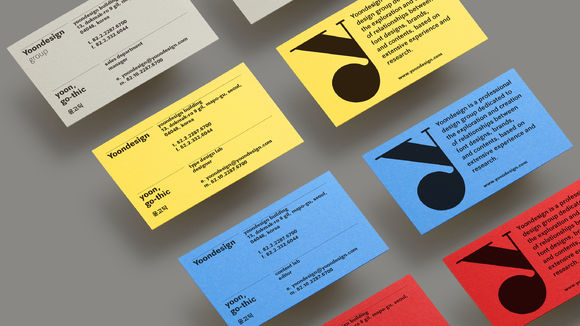
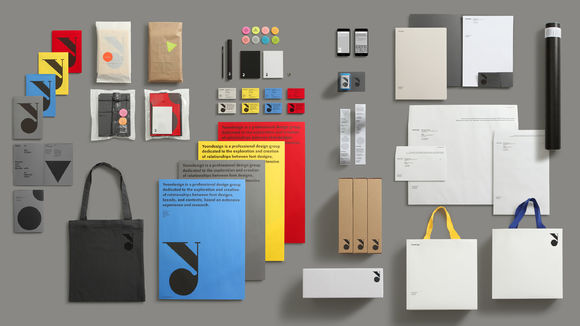
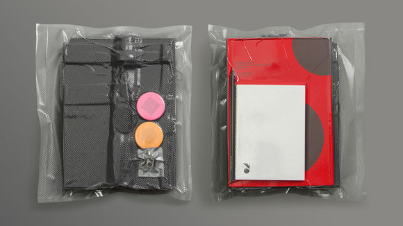
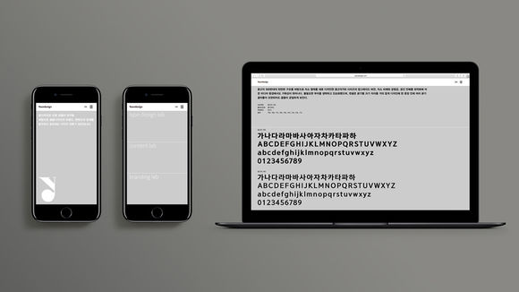
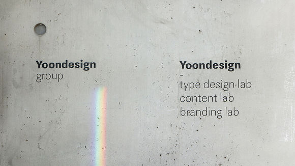
A pioneer of digital font design since 1989, Yoondesign offers a new platform that explores the link between font design and products and brands. The renewed identity allows them to express themselves as a specialist group with the aim to broadening the spectrum of design. The triangular relationship between typeface design, contents, and branding expands into a polygon, then eventually a circle, representing flexibility to change based on a variable graphic motif. Setting the basic tones of black and white as the embodiments of the light and pigment color primaries, the use of colors and graphic motifs are freely arranged to suit each medium.
发布于2019-11-28
设计公司
YOONDESIGN GROUP
设计师
Kim Sunghoon, Choi Chi-Young
设计奖项
德国iF设计奖
iF DESIGN AWARD/iF设计奖
2018 年
颜色
相关推荐
