1/2
LENDIT
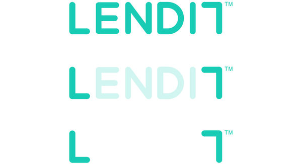
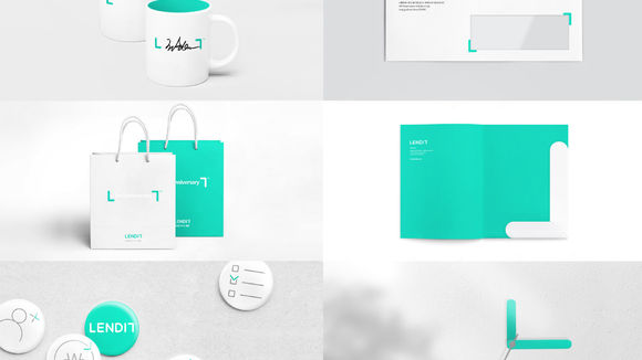
LENDIT is the largest personal loan oriented marketplace lending company in Korea. We operate an online marketplace platform where investors provide capital to people seeking loans. Since we leverage technologies to lower the costs of the traditional banking system and transform the finance industry, we selected the color mint as our main one to imply "trust" and "freshness." By transfiguring the letters L and T from the company name LENDIT, we developed a corporate identity symbol similar to a "parentheses" sign. This symbol delivers our brand identity in various situations both online and offline in a consistent manner.
发布于2019-11-28
设计公司
LENDIT
设计师
Jaedeok Yun, Sungjoon Kim
设计奖项
德国iF设计奖
iF DESIGN AWARD/iF设计奖
2017 年
颜色
