1/7
Le Santi
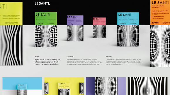
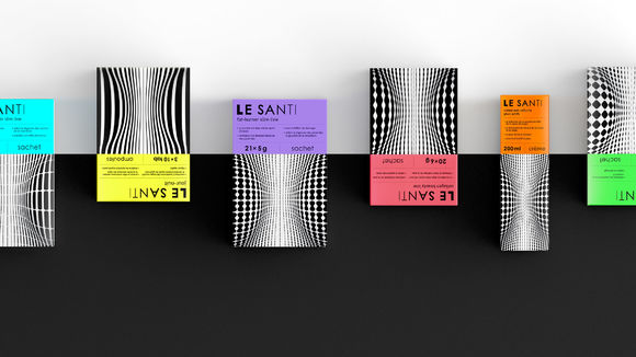
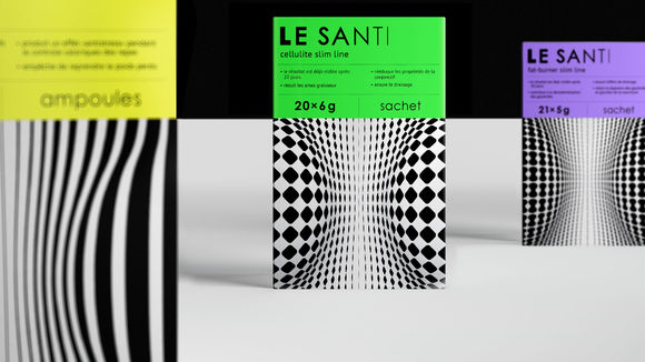
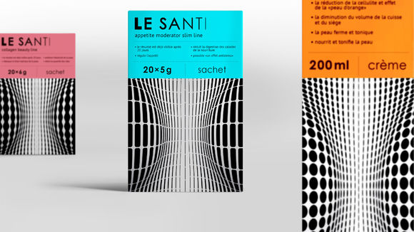
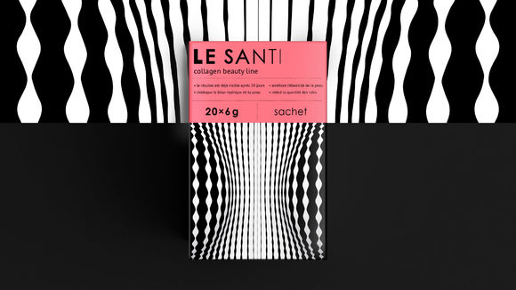
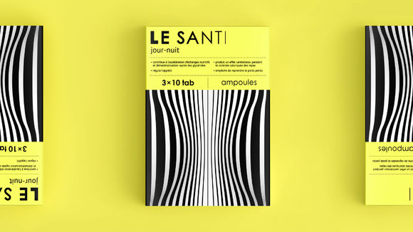
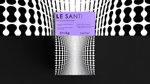
Our agency had the task to make an effective packaging to transport the idea of weight loss. The packaging presents the graphic shapes subjected to the optical metamorphosis as they are becoming thinner in the "waist." By means of this visual metaphor we show that the shape of the body can change right before one’s eyes. The packaging is balanced by the color blocks. Bright but not pimpish, spectacular but not irritating – it conveys the character and identity of the brand that is clear and attractive not only for the female audience.
发布于2019-11-28
设计公司
:Otvetdesign
设计师
Vladimir Fedoseev (Creative Director), Arina Yushkevich, Ksenia Alekina (Art Directors), Anna Lysenko, Nika Toroptsova (Designers, Illustrators)
设计奖项
德国iF设计奖
iF DESIGN AWARD/iF设计奖
2017 年
颜色
