1/2
RE
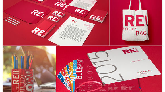
A brand focused on products to save natural resources and money: inspired by the brand idea "smart people inspiring a smarter planet," we created RE. Meaning “do it again,” RE brings many concepts to mind, such as REuse, REduce and REcycle. The identity has bold colors, typographies and phrases that lead to reflection and propose a wiser lifestyle, highlighted by its tagline: REthink. The multi-functional packaging comes with a seed paper that can be planted inside the package itself. The datasheets are grouped as needed, making it possible to customize and to reduce paper. Bold and truly sustainable, it stands out amongst its competitors now.
发布于2019-11-28
设计公司
saad branding+design
设计师
Lucas Saad, Carlos Bauer, Guilherme Hobi, Renan Ferreira, Ticiana
设计奖项
德国iF设计奖
iF DESIGN AWARD/iF设计奖
2017 年
颜色
相关推荐


