1/2
Akuma Office Logo
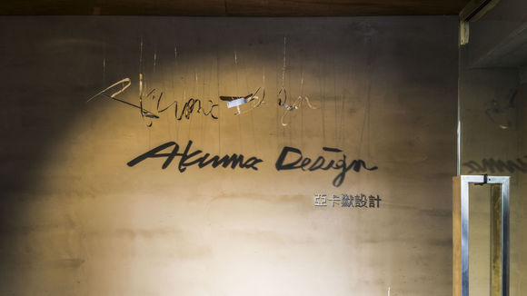
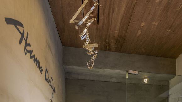
Upon first impression, the new Akuma Design logo seems to be just a row of twisted metal hanging from the ceiling. The actual logo can only be seen through the projected shadow from those very twisted metals. The design rhetoric of the logo lies in rhymes with the new Akuma Design office which looks more like a coffee house rather than a design house. The goal was to show not what these usual building materials represent under normal usage, but through innovative utilization we can have them tell a "different story." What can't be touched and seen directly, is where our true message lies.
发布于2019-11-28
设计公司
Akuma Design
设计师
Tim Chou, Brian Wang, Abby Wang
设计奖项
德国iF设计奖
iF DESIGN AWARD/iF设计奖
2016 年
颜色


