1/2
iKON DEBUT BRANDING
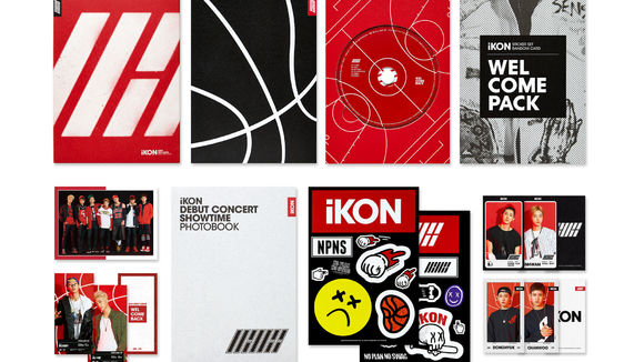
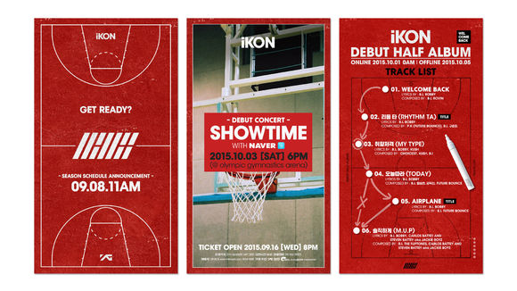
YG aspired to create an artist that can transcend ordinary K-pop. The hip-hop group iKON was the one. Members of iKON really enjoy hip-hop anywhere at anytime and are enthusiastic enough to write their own songs and prepare their stage performance. Their debut album is in a sportive mood to best-express the strong energy and freewheeling character. Moreover, the “iKON SLASH” was designed to represent Korea and symbolize iKON’s uniqueness, using REAL RED and CREW BLACK colors to visualize this crew’s passion for music.
发布于2019-11-28
设计公司
YG ENTERTAINMENT
设计师
SJ S (Creative Direction), Hyunju Lee (Art Direction),
Hyona Park, Chul Hwee Kim (Graphic Design)
设计奖项
德国iF设计奖
iF DESIGN AWARD/iF设计奖
2016 年
颜色
相关推荐
