1/2
Durex Invisible
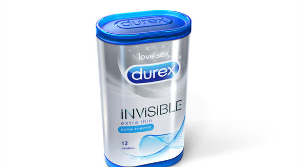
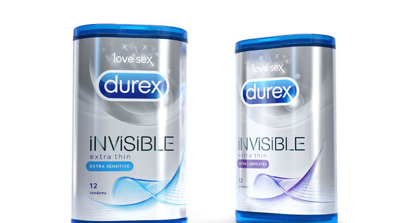
The new Durex packaging for extra thin condoms combines an innovative pack structure and graphic identity to give it a premium position in the condom category. The carton’s 3D shape and profile is created by the Durex brand mark, bringing to life this global icon as a flip top lid. The structure differentiates the brand at shelf against the competition plus adds value as a protective on-the-go reusable storage case. The carton is wrapped in a metallic shrink sleeve to maximize the graphic impact at shelf and cue the premium positioning of the new range. The design execution for the product name reflects the product’s "invisible" benefits.
发布于2019-11-28
设计公司
Superunion | Brand Union
设计师
Mark Lloyd, Patrick Bajohrs, Keelie Teadsdale
设计奖项
德国iF设计奖
iF DESIGN AWARD/iF设计奖
2016 年
颜色
相关推荐


