1/6
Müller US Redesign
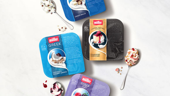
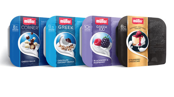
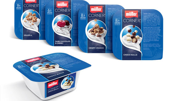
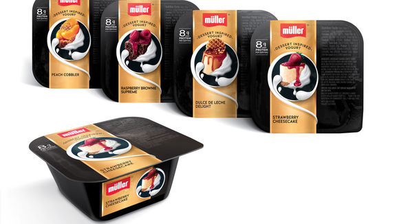
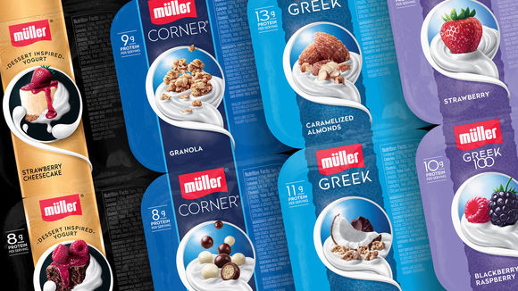
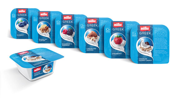
In the ever changing landscape of the yogurt category, there was a need to tell a more relevant and engaging brand story. A complete repositioning and redesign across the US Müller product portfolio resulted in a rich, layered story authentic to the brand’s European heritage, dairy expertise and delicious flavor experience – all crafted together to help elevate Müller yogurt. By breaking category convention and running the graphics vertically on the top panel, it created a faux wrap effect that connects the first point of connection, the side panel, with the top panel that heroes the story.
发布于2019-11-28
设计公司
PepsiCo
设计奖项
德国iF设计奖
iF DESIGN AWARD/iF设计奖
2016 年
颜色
