1/2
Z.A.G.POT
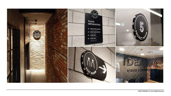
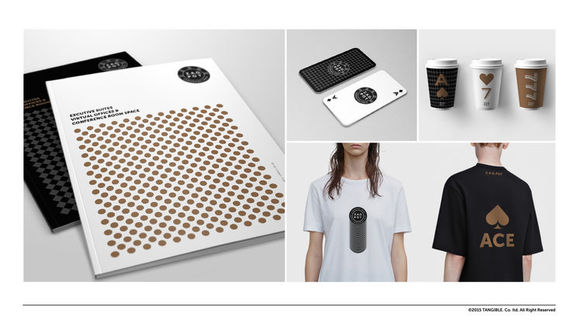
Z.A.G. POT is a "Coworking Space" brand which would create a new notion of work environment – "Work like Play." As when people playing games at the casino, Z.A.G. POT would be filled with positive energy / expectations for all start-ups’ business success. Implying that all users may win the jackpot, Z.A.G. POT stands for "Zenith," "Achievement," "Goal" and means "being at a zenith by achieving the goal." These three words are uniquely symbolized with three figures and four colors – black, gold, navy, red. Especially, black is used for Z.A.G. POT’s logo design representing "coexistence of diversity" as black could be a combination of all colors.
发布于2019-11-28
设计公司
Tangible.
设计奖项
德国iF设计奖
iF DESIGN AWARD/iF设计奖
2016 年
颜色


