1/2
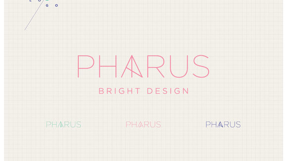
Pharus
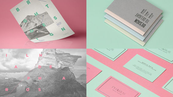
Alexandria Group’s design and innovation agency needed a name and a visual identity to reflect its mission: to translate the essence of brands with esthetic beauty and purpose. Pharus comes from Pharos, an island close to Alexandria, which had a lighthouse that guided oncoming vessels. Pharus illuminates the essence of brands and shapes their reason to be, through design. The lighthouse, with a stylized letter "A," moves in order to shed light in all directions. The multi-element graphisms represents the people behind each creation. In less than two years, brands like Nike and Danone already see Pharus as the benchmark for design in Brazil.
发布于2019-11-28
设计公司
Pharus Bright Design
设计师
Marcio Mota, Tauana Fernandes, Leopoldo Leal, Tatiana Rossi
设计奖项
德国iF设计奖
iF DESIGN AWARD/iF设计奖
2016 年
颜色
相关推荐
