1/2
Huatu
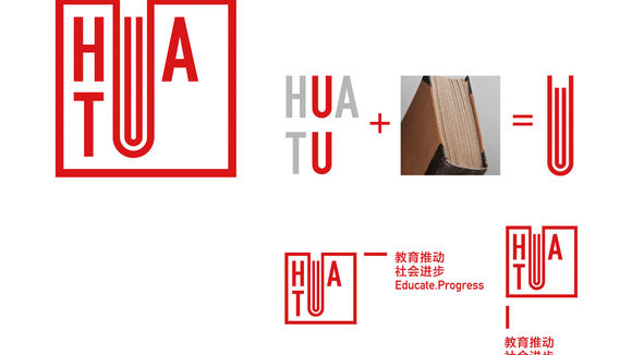
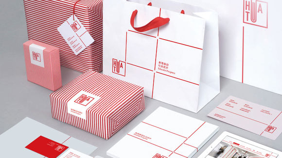
Huatu Training is an education brand in China. The striking simplicity of the logo mark makes it easy to remember. The two overlapping words, “Hua” and “Tu”, highlight their common denominator, namely the letter “u”. Amplifying this letter interestingly resembles a book (the essence of the business). To further stress the attributes of the industry, we applied the shape of a Chinese thread-bound book in the visual application, reflecting a strong sense of Chinese culture and form.
发布于2019-11-28
设计公司
Dongdao Creative Branding Group
设计奖项
德国iF设计奖
iF DESIGN AWARD/iF设计奖
2015 年
颜色


