1/2
hpp.com relaunch
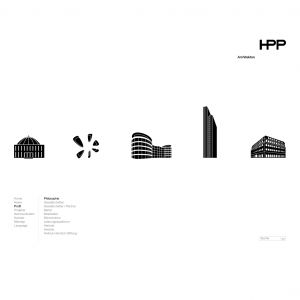
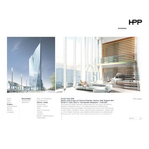
The communicative target of the relaunch was to create a contemporary and distinct interaction with the user, while at the same time communicating the company's image as a leading architecture firm. The characteristic feature is the central large-sized image area, where images can be scrolled playfully via mouse over function. By doing so the user receives within minimum time maximum visual information about the projects. The navigation of the content and textual information is simple, reduced and logical and is in its rationality a counterpoint to the visual level.
发布于2019-11-28
设计公司
HPP Architekten GmbH
设计师
Thomas Kaiser
设计奖项
德国iF设计奖
iF DESIGN AWARD/iF设计奖
2010 年
颜色


