
1/2
Naver GreenWindow
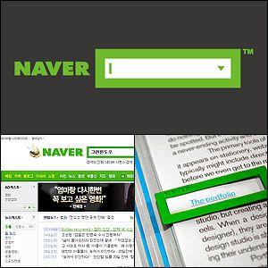
Naver is Koreas no. 1 search portal with the largest market share. However, it didnt have a visual identity, despite its popularity. A representative identity was greatly needed to instill a consistent and powerful brand image in the users mindset. No other portal website had set their service identity visually when they provided search service. Based on a belief that searching is a window to a whole new world, Naver materialized this concept into the Green Window paving a way for the search window to become its brand identity. Naver applied it to TV campaigns, products, service designs and print ads letting the viewers upon hearing the word Naver automatically associate search and Green Window.
发布于2019-11-28
设计公司
NAVER Corporation
设计师
Joh Su Yong (Creative Direction)
Jo Hang Soo (Art Direction)
设计奖项
德国iF设计奖
iF DESIGN AWARD/iF设计奖
2010 年
颜色
相关推荐
