1/4
tegut... gute Lebensmittel
15 years after their last redesign tegut... wants to make sure that the progress they have made internally will also be visible to customers and employees.
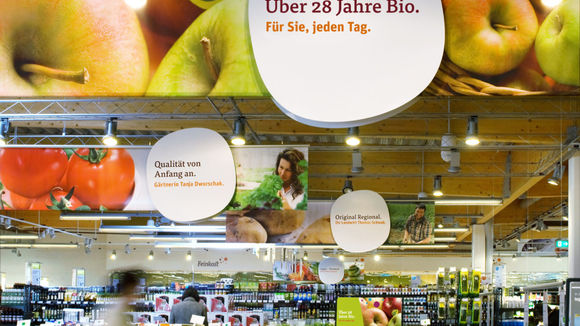
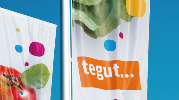
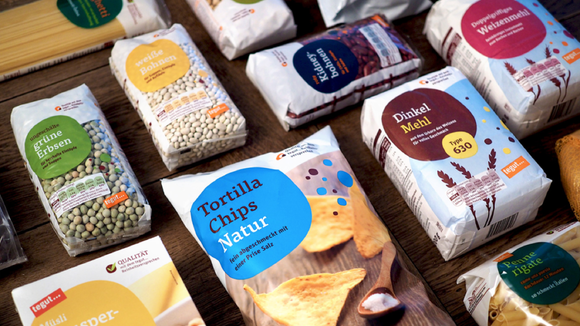
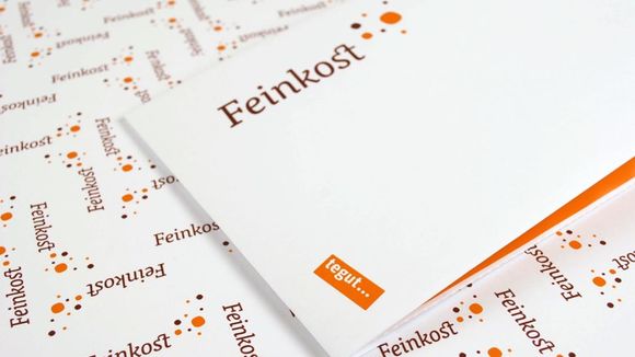
The house color remains orange but all other elements of the corporate design have been carefully modernized and express the company philosophy: lively, meaningful, simple and real. The chief visual element is the superellipse, a figure halfway between a circle and a square. In the new markets it creates a cheerful and functional means of orientation and is a unique feature for tegut....
发布于2019-11-28
设计公司
Edenspiekermann
设计师
Katja Grubitzsch, Erik Spiekermann, Markus Kirsch,
Christian Hanke, Thorsten Kozik, Arjan van Zeumeren, Jan Dirk Porsius, Eva van Veldhoven
设计奖项
德国iF设计奖
iF DESIGN AWARD/iF设计奖
2010 年
颜色
