1/2
INFOBAR
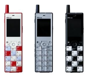
The large, square adjoining keys. The large screen. The rectangular body on which they are arranged. Both its thinness and reasonably light weight. These things aren't really new. I've just given form to a well-known idea, which leads one to wonder why up until now there have been no mobile phones shaped like this. Users always entertain two contradictory feelings regarding objects. One feeling is that they want "the same thing as everybody else". The other is that they want "the same as everybody else", but they want theirs "to be different". With the utilization of different color compositions, the simple form of this mobile phone is a platform that answers this need for individualism.
发布于2019-11-28
设计公司
Naoto Fukasawa Design
设计奖项
德国iF设计奖
iF DESIGN AWARD/iF设计奖
2005 年
颜色


