1/2
VT470
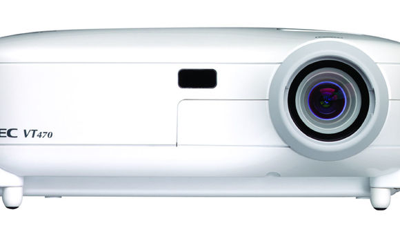
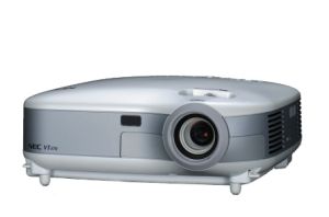
The VT470 projector: less really is more. – How do you maintain the balance between functionality and design? NEC's answer to this question is the "less is more" concept. This concept has been applied to the entire projector: from design and colour right up to operation. It's all about subtlety and simple adherence to the overall concept. With its rounded edges, the design of the new VT470 projector fits effortlessly into the decor of any room without being inconspicuous. A subtle pearl-white, a single grey stripe and the grey operation panel underline the individuality of the projector. The operation panel on the projector is yet another highlight. Here too, NEC consistently applied the concept of simple operation. The circular arrangement on the operation panel includes the most important functions, to secure a perfect projection.
发布于2019-11-28
设计公司
Naoto Fukasawa Design
设计奖项
德国iF设计奖
iF DESIGN AWARD/iF设计奖
2005 年
颜色


